Toolkit on accessibility for people with visual impairment for employees of self-governments
Table of Contents
- Chapter 1: Introduction to Accessibility
- Chapter 2: Visual impairment and its consequences
- Chapter 3: Accessibility of Physical Environment
- Chapter 4: Accessible information
- 4.1 General overview of the importance of digital accessibility for people with visual impairment
- 4.2 How users with visual impairment use the web/apps/docs
- 4.3 Assistive technologies (an overview, practical examples)
- 4.4 Web Content Accessibility Guidelines
- 4.5 Accessibility in practice
- 4.6 Web and Documents Accessibility Evaluation
- 4.7 Other sources (e-books, online courses…)
- 4.8 Accessibility Certification (IAAP)
- 4.9 Accessibility of information – legislation in the Slovak Republic
- Chapter 5: Interpersonal communication
Chapter 1: Introduction to Accessibility
Authors: Michaela Hajduková, Branislav Mamojka, Slovak Blind and Partially Sighted Union, Slovak Republic
Accessibility means products, equipment, services, or environments designed in such a way that they can be used independently by people with disabilities. This, of course, does not preclude the use of compensatory aids and assistive technologies where it is absolutely necessary. (1) According to the general comment No. 2, Accessibility, of the UN Convention on the Rights of Persons with Disabilities accessibility is “...a prerequisite for persons with disabilities to be able to live independently and participate fully in all aspects of life. Without access to the physical environment, transport, information and communication, including information, and communication technologies and systems, as well as to other facilities and services available or provided to the public, persons with disabilities will not have equal opportunities to participate in life in the societies concerned.”(2)
It is also important to distinguish between accessibility, i.e. the term we defined in the previous paragraph, and availability or affordability. Availability means that a product, service, an internet website is within our reach or at our disposal. If something is available for a person with a disability, it does not mean that it is accessible. For example, a book by a well-known Japanese author has been translated into Slovak, i.e. it is available, but is not in an accessible format (audio or electronic form). For example, everything we can afford to buy or what is generally at anyone’s disposal, such as a bus station or an online form, can be classed as available. However, it will only become accessible when a person with a disability is able to use it on their own. In Slovakia, the term "accessibility" is often incorrectly interchanged with the term "availability” (this also applies to derived words, such as available vs accessible, etc.). This fact can have far-reaching negative consequences because instead of the necessary accessibility, the professional and lay public can be appeased with the availability of buildings, transport, information, services, and goods. It is still commonplace that we encounter this mistake in some legislative and other binding documents. Therefore, when promoting accessibility, it is crucial to strictly adhere to the correct terminology in discussions, but especially in legal acts.
So we have the definitions, but how does it work in reality? In theory, a person with a medical condition, i.e. in our case person with a visual impairment, should have conditions created to allow them to live a full life just like any other person. Will the blind Mr. Hrdlička visit the client centre at the town council because he needs to solve the problem with the waste collection from his house? First and foremost, he should be able to find information about the opening times, as well as what to bring with him, on the internet. Secondly, he should be able to get to the appropriate counter without any problems. Here, the client-facing worker will deal with him in such a way so that both participants in the discussion feel good – Mr. Hrdlička because he resolved his problem, and the client-facing worker because he helped him.
To achieve this positive situation as often as possible, the state, the trader, the employer, the service provider, etc. should provide so-called reasonable accommodation, or in case of the websites minimum accessibility requirements. This means that they should adapt the necessary environment (physical, information as well as services and factors related to communication with visually impaired people) to be accessible to the visually impaired. For example, a website of your town or community should be programmed so that a blind person can easily use assistive technology (reader screen or magnifying software) to find their way around the site and find the required information.
What is the role of experts in the area of public administration? To create an environment, in which the visually impaired people can get the best resolution when sorting out their issue or when dealing with public administration.
In our guide, we divide accessibility into three groups:
- Accessibility of the physical environment and transport (audible traffic lights, announcement of stops in public transport),
- accessibility of information (leaflet in enlarged black print, embossed QR code on printed material, using which the blind can view the content of the material via the internet, accessible website including published documents and forms),
- accessibility within the framework of interpersonal communication (assistance of the client employee in signing documents, notification of visual information during communication).
In order to understand how to create an accessible environment for the visually impaired, you mainly need to have a good understanding of the legislation that regulates this area. Of course, it is not enough just to have an overview. It is also necessary to apply it consistently in practice and, last but not least, to draw attention to it to those who do not yet use it in their professional life. We will deal with the topic of legislation in more detail in Chapter 2.
It is also essential to know specifically, what accessibility is in different areas and what you may encounter in your work. You can read more about this in the chapters on specific areas of accessibility.
When thinking about accessibility, it is also important to realise that at some point in our lives, it concerns each of us. Whether we have parents at an age when it is not entirely easy to read a leaflet written in fine print, or we just broke our leg and cannot use the stairs. Sometimes it just about pulling bulky luggage behind us or pushing a pram with a baby.
We believe that after reading our handbook, you will have gained more information on the topic of accessibility and that you will use it effectively when working with all citizens, regardless of whether they have a disability or not.
1.1 Bibliography
- Henry, Shawn Lawton; Abou-Zahra, Shadi; Brewer, Judy (2014). The Role of Accessibility in a Universal Web. Proceeding W4A '14 Proceedings of the 11th Web for All Conference Article No. 17. ISBN 978-1-4503-2651-3. Retrieved 2014-12-17.
- Všeobecný komentár č. 2 (2014), Výbor pre práva osôb so zdravotným postihnutím OSN, Dohovor o právach osôb so zdravotným postihnutím, DOC type, 160kB
- Convention on the Rights of Persons with Disabilities (CRPD)
- General comments, Committee on the Rights of Persons with Disabilities
1.1 List of technical terms
- Accessibility
- Availability
- UN Convention on the Rights of Persons with Disabilities
- General Comment on the UN Convention on the Rights of Persons with Disabilities
- Appropriate adjustments
- Assistive technologies
- Compensatory Aids
Chapter 2: Visual impairment and its consequences
Author: Dagmar Filadelfiová, Slovak Blind and Partially Sighted Union, Slovak Republic
Visual impairment is generally considered to be a serious limitation to a person's life. It is not easy to imagine what a visually impaired person might be able to see. When trying to describe how people with different degrees of visual impairment can see, we cannot wholly avoid specialist terminology used to characterise visual impairment. It is, however, important to realise that the exact ocular diagnosis, the same value of visual acuity, or similar visual field losses may have very different functional consequences. Thus, people with similar diagnoses may be affected to different degrees in terms of their daily functioning, i.e. how much help they need, what they can do, what assistive aids they use, how they handle different situations and what interactions they have in the environment.
2.1 Characteristics of visual impairment
According to the World Health Organization (WHO), the severity of visual impairment can be classified based on reduced visual acuity and visual field loss. Simply put, when we talk about a visually impaired person, we mean a person who, even with the best possible correction (glasses, contact lenses), cannot see sharply or is unable to see the space around them in full. According to these criteria, visual impairment may be classified into the categories of partial sight, legal blindness and total blindness.
- Partially sighted people experience problems performing work requiring visual input, but they have some residual vision that can otherwise be well utilised. Their visual perception is reduced in terms of speed and accuracy, meaning they are prone to inaccuracies, distortions or fatigue when performing visual tasks.
- Legally blind people have small remnants of eyesight preserved which enable them to perceive light, contours, shapes of objects, but they cannot use sight as a dominant and only analytical tool for work, orientation or obtaining information. Severe visual impairment results in largely limited or distorted perceptions and visualisations.
- The blind cannot obtain information from the outside world visually and thus depend on the use of other senses. The blind also include those who are able to distinguish light and darkness but are unable to determine where the source of light is coming from.
- People with binocular vision disorders suffer from disturbed functional balance and cooperation between the left and the right eye. This causes problems in the visual perception of space and depth. Common disorders of binocular vision include strabismus, commonly called squinting, or amblyopia.
2.2 Impairment of visual functions and its consequences
To get a better idea of the different ways in which visually impaired people can see, it is important to get a basic understanding of visual functions, which, if impaired, cause problems in visual perception and, consequently, in performing various activities.
- Decreased visual acuity. Visual acuity can be defined simply as the ability of the eye to distinguish details regardless of whether we look at them from up close or from afar. A person with reduced visual acuity sees a blurred image as if through a fog. At the same time, they may be sensitive to light and have difficulty recognising certain shades of colour. It is important to realise here that even the best spectacle correction cannot undo visual impairment: whilst glasses can help the affected person, their ability to see is still poor. People with impaired vision will have problems reading, writing, recognising peoples' faces, or performing manual activities requiring focus on detail. They might, however, be able to move around independently.
The following image shows the difference between sharp and blurred vision in space.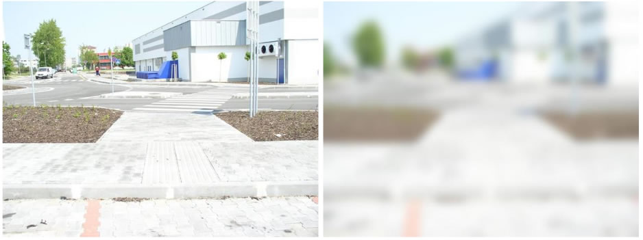
- Visual field loss. Peripheral vision informs us of what we are seeing in front of us and around us when we are moving around in space. With regards to peripheral vision, it is not the acuity that matters, but the extent of the visual field. People with visual field losses cannot see certain parts of space at all or see them poorly. In more severe cases, we refer to tunnel or tube vision. Spectacle correction often does not help in people with visual field loss, and it can even do more harm than good. This type of visual impairment causes severe problems with mobility or orientation in macro or micro space. It can put the affected person's safety at risk as they may notice objects in space too late or not at all. They may have trouble finding a specific thing or keep overlooking it. On the other hand, they can retain visual acuity, thus a person with a tunnel vision, for example, can read without difficulty.
The following images show the differences between normal vision and vision loss in the central and peripheral visual fields.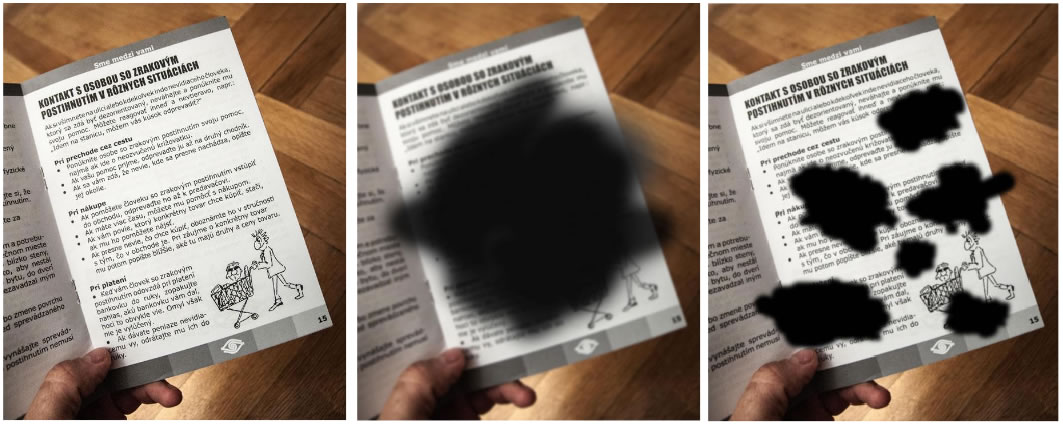
- Colour vision deficiency. When we talk about complete colour blindness, we mean the inability to perceive colours across the whole spectrum. In this case, a person can only see black and white in various shades of grey. However, it has to be noted that this type of colour vision deficiency is rare, and it is much more common that the disorder only relates to specific colours, such as red (protanopia), green (deuteranopia) or blue (tritanopia). A person with this type of disorder may have problems whilst driving, matching clothes, or sorting laundry for washing.
The following images show normal vision and vision affected by colour vision deficiency.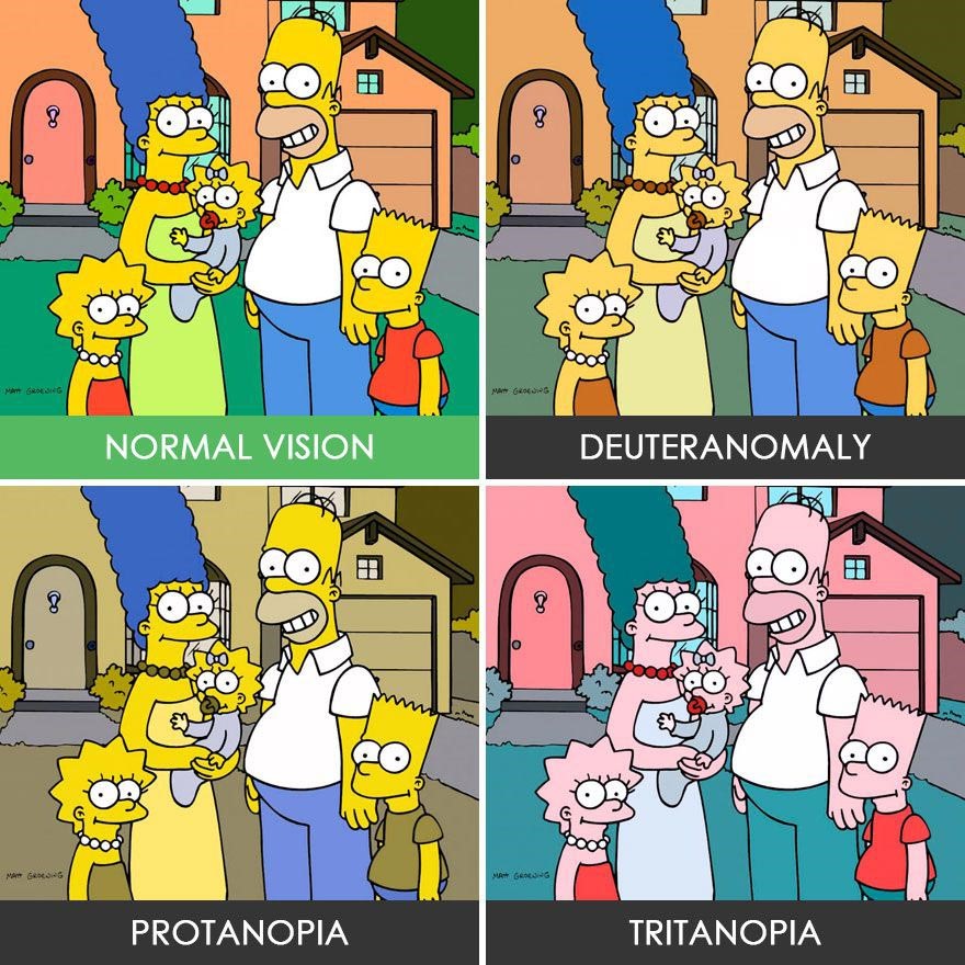
Source: www.refresher.sk.
- Problems with accommodation and adaptation to light. Many visual diagnoses cause varying degrees of sensitivity to light up to photophobia. Visually impaired people may have difficulties when going from darkness into light or vice versa, and their eyes may need more time to adapt to changing distances or to changing lighting conditions.
2.3 How can we help?
- Prints and documents should be prepared using the principles of Clear Print, which is suitable not only for visually impaired people but also for seniors and all those who care about their eyesight (see more on Clear Print in Chapter 4). In practice, however, there are still few appropriately designed prints, and in most cases, people with reduced visual acuity need to use optical or electronic magnifiers, which enlarge texts and appropriately adjust the contrast and lighting. In this situation, it is essential that you do not rush the person and leave them enough time to read the text at hand. In case of a blind person, ask them if they need your help reading it. When reading out official or financial documents, be tactful and maintain confidentiality, read the whole text or follow the instructions of the blind person.
- You can make writing easier for them by using a black marker or a thicker pen producing a more pronounced line. Highlighters may also be useful when marking a text. If a visually impaired person needs to sign a document, you can navigate them by pointing a pen at the space where signature is to be placed. Some people tend to use a pointer or a finger, which you can put at the place where they need to sign.
- The use of contrasts and good lighting may help the visually impaired to distinguish details at a distance as well as from up close. This means that if you want to help a visually impaired person to find, for example, a cup on a white table, you should choose a dark coloured cup. They will be much more likely to notice the dark cup rather than a white cup or a glass which blends with the surface. Contrast can indeed be very helpful at a dinner table. You can also help by describing the food on a plate according to the clock face.
- At a meeting, address the blind person and introduce yourself so that they know who they are talking to. In conversation, make sure that the light falls on your face rather than on them, since direct light could be blinding.
- If you want to help a visually impaired person, you should always ask first if they do indeed need your help. Respect their choice!
These are just a few simple tips on how to help visually impaired people. They can, however, meaningfully contribute to improving not only their lives but our lives as well.
2.4 Bibliography
- KIMPLOVÁ, T. – KOLAŘÍKOVÁ, M. 2014. Jak žít s těžkým zrakovým postižením? Souhrn (nejen) psychologické problematiky. Prague: Triton, 2014. ISBN 978-80-7387-831-3.
- MORAVCOVÁ, D. 2007. Zraková terapie slabozrakých. Jak efektivne využít slabý zrak. Prague: Triton, 2007. ISBN 8072549499.
- ÚNSS, Príručka pre pracovníkov s mládežou i pre ZP lídrov.
- ÚNSS, 2016. Sme medzi vami, PDF type, 742,kB
Chapter 3: Accessibility of Physical Environment
Authors: Susanna Laurin, Esther Davidsen & Emil Gejrot, Funka, Sweden, Pavol Korček, Slovak Blind and Partially Sighted Union, Slovak Republic
3.1 General overview of accessibility needs
How do the visually impaired/the blind orient themselves in physical spaces? What are their mobility prerequisites?
To ensure that buildings, roads, transport and public spaces are accessible for persons with visual impairments, you need to:
- Comply with standards and regulations, as described at the end of this chapter in “legislation and regulations”
- Always test with users. No matter if you are planning or building a new facility, or if you are renovating an existing one, involving people with visual impairments from the beginning of the design process is a key to success. The standards and regulations are covering minimum requirements, but for any environment to be functional to all user groups, it needs to be tested in real life.
You must be aware of how visually impaired individuals orient themselves in physical spaces and what their mobility prerequisites are.
When the vision is severely impaired, individuals lose the overview of surroundings that sighted people have. Therefore, a blind or severely visually impaired person depend on predictability, order and systematics is in all aspects of daily life, both indoors and outdoors.
Blind people typically rely on sensory information from the tip of a long cane combined with auditory information.
Unexpected obstacles can make access difficult or impossible for this group: cracked and uneven floor surface results in constant snagging of the cane; objects and clutter on the floor can also hinder progress; objects which protrude at above waist height will not be detected by the cane resulting in a collision. Visually impaired people have some vision and use different strategies to orient themselves but are still not be able to detect very close or looming objects, or irregularities at floor level.
3.2 Transport
What are the transportation needs of the visually impaired/the blind?
Like everybody else, people who are visually impaired are individuals with individual needs who have different alternative strategies and make individual choices when it comes to transportation.
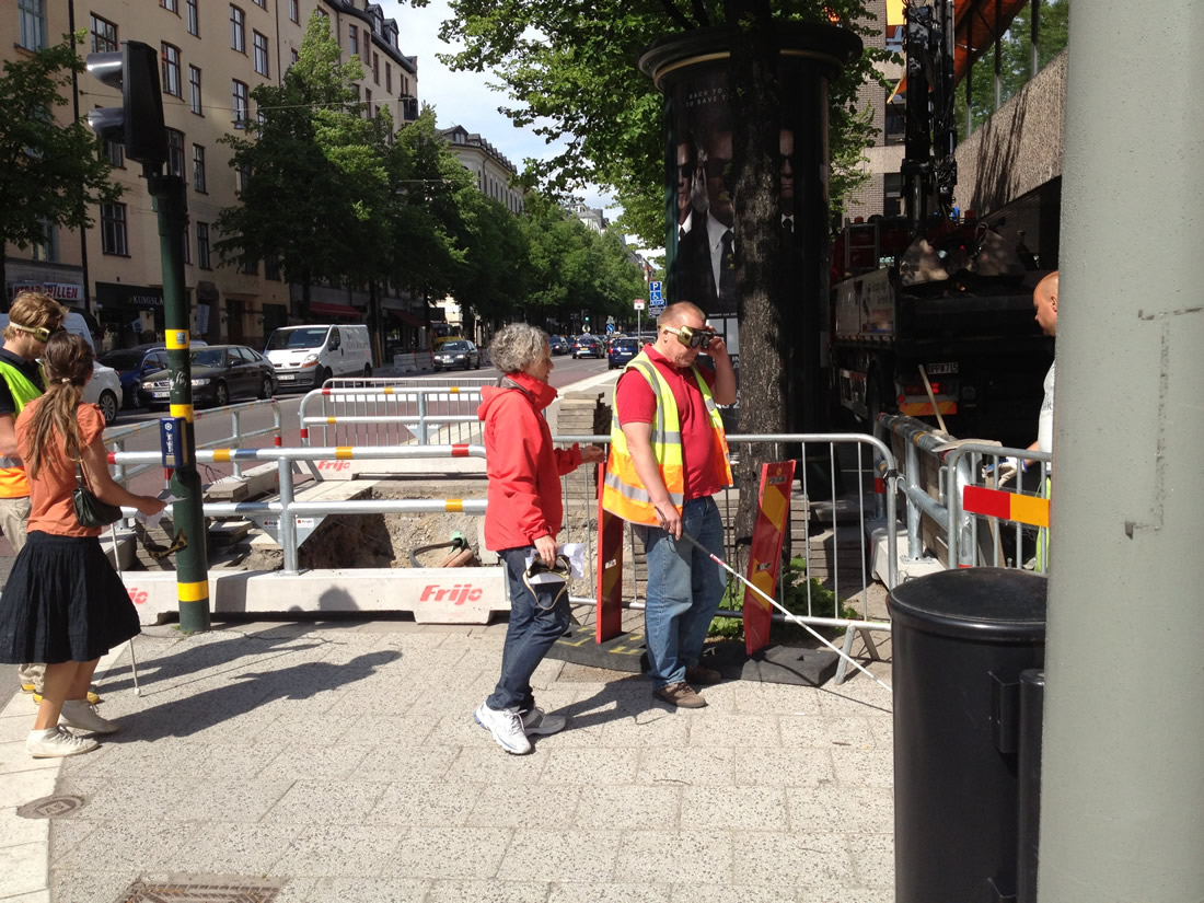
Some use a sighted friend, relative or professional as a guide, which involves holding onto someone's arm. Others use a long, white cane to identify and avoid obstacles or elevation changes, still others use a guide dog. Some use special optical or electronic aids, and some use no aid at all.
The choice of transportation aid depends on the extent and nature of their visual impairment, personal preferences, lighting, and familiarity with the area.
Many factors are being put to play in order to travel independently. People with visual impairments use whatever vision they have, auditory and tactual information, and any gathered knowledge of an area to keep track of their location and make travel decisions.
3.2.1 Sighted Guide
At one time or another, most people who are visually impaired will make use of the sighted guide technique, in which a person with sight serves as a guide to a person who is visually impaired. It is important to note that the guide should offer his or her elbow or arm for the visually impaired person to hold onto – not the other way around, to ensure that it is the visually impaired person who decides the speed, and that he/she can feel the guiding persons movements.
3.2.2 Long white cane
It is always impressive to meet visually impaired in the streets who move independently, and on their own using a long white cane as mobility device. The cane can be used in different ways, and the usage requires a lot of training. The most common technique for blind, is to extend the cane and swing it back and forth across the body in rhythm with the steps to provide information about the environment directly in front of them, such as elevation changes or obstacles. In another technique, often used by people with low vision, the cane is held diagonally across the body, with the tip above the ground. They employ the cane occasionally to check object or sidewalk surface, when they are unsure about what they are seeing.
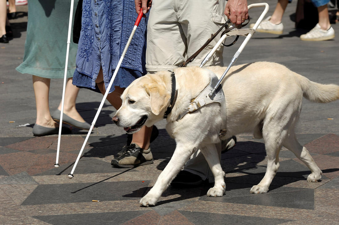
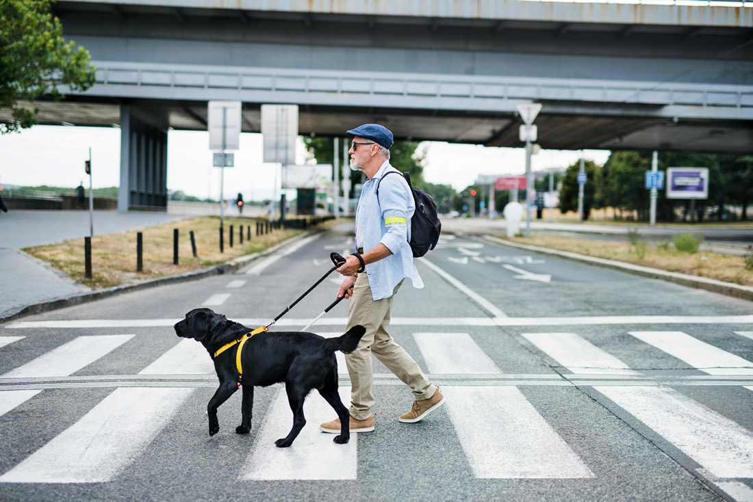
3.2.3 Guide dog
Guide dogs are carefully trained service animals who have learned to help visually impaired persons in their daily life, including when using public transportation and moving in the streets. The dogs are trained to respond to the commands of its handler, such as right, left and forward. The guide dog will guide the handler around obstacles and stop at curbs or stairs. However, the handler must know the way to the destination and must also make decisions about the proper time to begin a street crossing. Guide dogs move in response to directions from their handlers and are trained to disobey commands to avoid danger.
3.2.4 Other strategies for orientation and travel
Not all blind persons use a long white cane or guide dog. People who are visually impaired often rely on their remaining sight and auditory and tactile cues in their surroundings for orientation and travel. Some may also use aids such as telescopes for specific tasks.
3.2.5 Orientation and mobility training
Visually impaired receive orientation and mobility training, provided by a specialist.
Orientation is the ability to understand where one is located in space and mobility refers to being able to travel through that space safely. The goal of most orientation and mobility training is to prepare a person who is visually impaired to travel in a variety of environments, both familiar and unfamiliar, and to assess new intersections and travel new routes. It is important to note that orientation training and assistance is not provided for every route that a person who is visually impaired needs to travel. Rather, the training aims to teach the visually impaired person a strategy for managing different situations that will sooner or later occur when using public transportation.
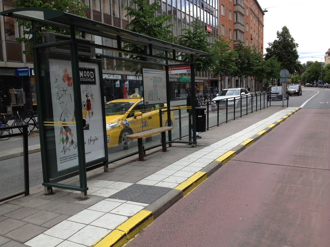
3.2.6 Stations and stops
For a visual impaired person to be able to travel independently, stations and stops need to be accessible.
- Station/stop markers, benches and shelters should be easy to find and contrast with their surroundings.
- Signage must be large and with good contrast
Next stops and other journey information must be provided in audio. Raised bus stops and even surfaces make boarding easier.
3.3 Public areas
How should public areas be designed to be accessible to help visually impaired/the blind carry out the complicated task of orientation?
We are all overwhelmed in public areas, where many different activities are happening at the same time, in a shared space. For visually impaired persons to be able to use the public areas on equal terms with sighted people, you must carefully design public areas in an accessible manner.
A person with a visual impairment experiences that the surroundings - right down to the smallest detail - change from day to day, which can be experienced as very challenging and often as frightening or dissuasive.
Excavations, scaffolding, bicycles, which are placed on all leads and edges of the pavement, which are locked to lampposts or railings, signs and café tables, which are displayed to entice customers to, etc., are all elements of the changed pattern, especially for the blind and partially sighted, who are relatively novices in terms of mobility, make moving outdoors difficult. To move safely, bearing markers and identification marks are used, e.g., the paving stone in the sidewalk, cobblestone driveways, the sound of the jukebox in the cafe as well as a sense of how far down a sidewalk one has to go to find the corner, bus stop or basement descent to the kiosk. Obstacles, unexpected setups, a pile of parked bikes, etc. break the rhythm and pattern that the blind pedestrian navigates and can knock that person completely off course.
3.3.1 Pedestrian and non-pedestrian spaces
For orientation, independence and safety reasons, you must ensure, that the separation between pedestrian and non-pedestrian spaces are clearly marked, both visually and tactile. The visual marking is often high contrasting colours, while the tactile markings can vary depending on the surrounding surface.
The most efficient way to mark the difference between the street and the pavement is by difference in height. For wheelchair users, people with baby strollers or suitcases on wheels as well as for service vehicles, curb ramps are often created, but this may make it hard for visually impaired to understand where the pavement stops, and the stress starts.
3.3.2 Intersections and pedestrian crossings
Accessibility for people with a visual impairment can be a major challenge in places where driving traffic has to be crossed. It can be difficult for the blind or partially sighted to find directly across the opposite side of the road and not accidentally end up in the middle of the intersection. The engine noise of a passing car can obscure the sound of a car driving behind, and cyclists are rarely heard. If there are no other pedestrians nearby, the visually impaired pedestrian is completely left to his or her own senses. To ensure good accessibility and safety for the blind and partially sighted, it is therefore of great importance that road junctions and regulated crossings are planned and arranged so that it is clear where and how the road can be crossed safely.
3.3.3 Street crossings
Techniques and cues used in crossing streets are diverse and vary by the type of location and by the individual and his or her level of vision and preferred mobility strategy. Visually impaired people often travel to unfamiliar areas and intersections and they depend on gathering information from available sources on the way in order to be able to move safely.
Once pedestrians, who are blind, are familiar with an intersection, they do not usually need to analyse the intersection and traffic control system at length every time. However, they still may need to listen long enough to determine that they are at the correct location and that the signal is functioning as usual. Pedestrians who are blind will still need to detect the street, align to cross, identify the interval where pedestrians are allowed to walk, and maintain alignment while crossing. Accessible Pedestrian Signas (APS) are useful to assist with the task of identifying the ”walk” interval at familiar and unfamiliar locations. An Accessible Pedestrian Signal (APS) is a pedestrian push button that communicates when to cross the street in a non-visual manner, such as audible tones, speech messages, or vibrating surfaces.
3.3.4 The Stockholm model
One example of a solution to this cross-disability challenge is the so called “Stockholm Model”, a solution that meets the needs of people with visual as well as motor impairments. In a pedestrian crossing using this model, flat surfaces for rolling assistive technology are used separately, with tactile surfaces such as paving stones next to them. The tactile part functions as a natural guideway for the visually impaired.
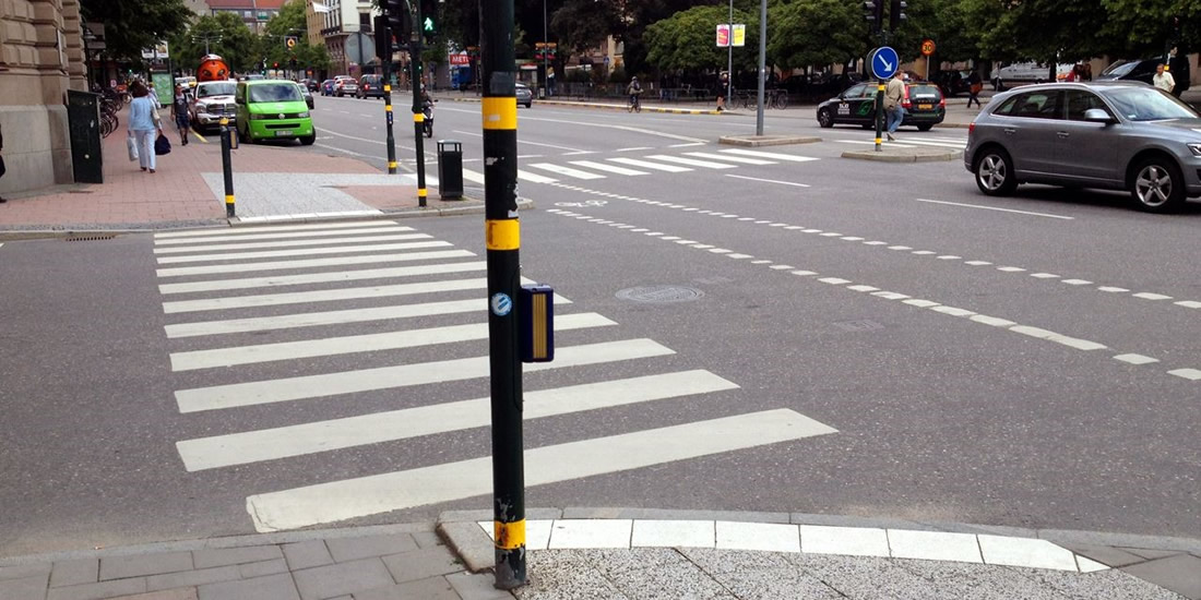
A ramp between street level and walkway on one side of the post and retained edge for orientation on the other side of the post is an elegant solution.
The Stockholm model consists of:
- Concrete slabs, so-called ballast slabs, with black and white, coarse-grained structure.
- White, smooth concrete slabs that contrast with the street's black asphalt.
- Signal pole or pole with road sign that marks a pedestrian crossing.
- A level-adjusted ramp for people with rolling aids.
- White, wide lines that mark the pedestrian crossing on the asphalt.
People with visual impairments who come walking follow either the curb or the inner edge towards, for example, the house facade with its white cane. Most people with visual impairments have some form of visual acuity, which means that the street's contrast markings at the pedestrian crossing facilitate orientation (for example, the white paving stones that mark the direction of the pedestrian crossing). For people who use tactility for orientation, it is the change in the material on the pavement and the sharp curb that marks the transition from the walkway to the car road.
A main idea with the design of the Stockholm model is that people with visual impairment should always be met by an edge when they reach the end of the sidewalk. The edge acts as a warning signal that you now come out on the street where cars are driving. Therefore, the ramps for people with rolling aids are slightly retracted, i.e., there is a little outside the walking direction. The ramp must always meet a ramp on the other side of the crossing. For many people with rolling aids, the ramp is indispensable, which makes road operation and maintenance necessary for the ramp to be usable during different weather conditions. The clever thing is that the ramp is also used by smaller snow removal vehicles.
3.3.5 Guiding lines
A guiding line is a coherent tactile coating strip that differs significantly from its adjacent surroundings in contrasting color, height and surface structure. When guiding lines are laid out and integrated correctly in the environment, it is of great help to the blind and partially sighted. A good and useful guiding line with integrated attention fields involves both the senses of hearing, hearing and sight. It must be possible to follow the guiding line using the residual sight, the white cane and tactility through the sole of the shoe. If there is a sound difference when touching the guide line and the surrounding coating with the white stick, an extra helping dimension is given.
3.4 Buildings
How do the visually impaired/the blind enter and orient themselves in buildings? How should rooms be designed?
3.4.1 Colour contrast
Colour contrast is another key component in your toolbox when designing spaces for persons who are visually impaired. Being able to distinguish objects from another is often very important to be able to orient in a physical space. Experience has taught us, that a building can be logically laid out, include proper use of signage, provide good lighting but still cause disorientation if the colour contrasting is too low. Therefore, remember to always include colour contrast, which can be used very effectively for many purposes such as:
- To draw attention to signage
- To define a route or direction – guiding lines
- To define areas
Colour contrasting items are also a very effective means in defining spaces. A colour contrast of 70% is generally recommended to clearly define items such as:
- A dark door frame, against a light door and a light wall.
- A light floor colour with a dark perimeter against a light-coloured wall.
- Handrails that colour contrast with the surrounding wall colour.
- Stairs need to have a colour-contrasted start and ending.
- Furniture that is colour contrasted with the floor and walls assists in locating furniture.

3.4.2 Tactile surfaces
Detectable floor surfaces are very useful accessibility design elements, as they will alert the visually impaired person to a hazard ahead. They have a texture that can be felt under foot or detected by a person using a long cane. These can be used for orientation or warning in many different situations. The texture can be built in or applied, but often works best when naturally integrated into the design, rather than being constructed and adding specific markings made only for visually impaired.
Always keep in mind that tactility may cause a barrier for people with motor impairments, so they need to be applied in a way that benefits both groups.
3.4.3 Stairs and handrails
It is easy to imagine, that stairs always pose a potential danger to the blind and partially sighted and falling accidents often occur on stairs. You must therefore ensure, that stairs are marked correctly and always have handrails.
You must always add colour contrast or materials of a different texture to the lip of every step to make sure people can determine the end of each new stair. Those with partial sight will see the change in color, while blind people can feel the different textures with their feet or stick.
You must also ensure that the stairs are constructed with consistent stair height, to help visually impaired individuals navigate stairways. Stairs must also, as a minimum, be clearly marked with attention areas both before and after the stairs, such as protuding buds or mats in a different texture.
Handrails are mandatory, must be placed on both sides of your stairways and should be continuous all the way down; if they aren’t continuous, they have to run on enough at either end to help users still find their way to the top/bottom. Please also ensure, that handrails have rounded ends or attach to walls or posts at the top/bottom of the stairway.
3.4.4 Signs
You should always ensure that signage is consistently located at some height and distance from the door to which it defines. As a general rule, all letters should be raised, tactile and in colour contrast to the background. The signs themselves should also be colour contrasted with the surrounding wall surface and the sign lettering.
You should use braille in signage which identifies rooms or spaces such as auditoriums, cafeterias, washrooms and floor numbers, and both inside as well as outside elevators.
3.5 Acoustics and lighting
What are the acoustic and lighting needs of the visually impaired/the blind?
3.5.1 Acoustics
Remember that blind and visually impaired people often use their auditory sense to orient themselves in a space. Involve the users to design an intelligent the sound environment, which can assist in providing orientation clues. A visually impaired person can then use reflected sound to determine a room size, the presence of corridors and proximity of walls or other structural barriers.
Please pay attention to adverse problems such as high levels of ambient sound or high levels of reflective sound, which can make auditory orientation impossible, . Here is your auditory check list for designing and building space:
- Well-defined, acoustically alive spaces are easier for people who are visually impaired to navigate safely. Remember that physical objects such as escalators, fountains, and elevators can create useful sounds for orientation. Sound reflections are frequently a good source of auditory cues.
- Carpets, acoustic tiles and furniture reduce sound reflectance. User tests should be conducted to ensure correct reverberation so that people can obtain a feel for the space.
- Invasive noise sources may mask sounds intended to provide directional cues, such as ventilation ducts or air-conditioning units. Remember the user tests to get an extra pair of ears on the sound design.
3.5.2 Adequate lighting
Ensuring adequate lighting may be your most important attention point to organise the physical space for the blind and visually impaired. It is true, that the lighting needs of persons who are blind or visually impaired naturally vary according to particular eye conditions. One level of light might work well for a person with glaucoma and be too low for someone with macular degeneration. In addition, glare can be a significant issue for those with many types of eye conditions such as glaucoma, cataract and macular degeneration. Therefore, issues such as the direction of light and its reflection on shiny surface need to be taken into consideration, and carefully tested with users. The use of variable lighting controls, indirect lighting and window shades can mitigate issues caused by glare.
3.6 Legislation and regulations
What rules are there for the accessibility of the built environment in terms of the visually impaired/the blind?
The basic legislative document governing the accessibility of the physical environment is the Decree No 532/2002 Coll. of the Ministry of the Environment of the Slovak Republic, which sets out the details on general technical requirements for construction and general technical requirements for buildings used by persons with limited mobility and orientation.
Requirements relating to buildings used by persons with limited mobility and orientation are specifically outlined in Section 4 of the decree and in the annex to the decree. The introduction to this section lists buildings to which the requirements apply. The subject part of the decree consists of three sections.
Section 1 addresses the provisions for access, local roads, and public areas. Section 2 deals with a design of residential housing and other residential properties, special purpose flats, special purpose family homes, and buildings with protected workplaces. Section 3 focuses on a design of non-residential buildings and civil engineering constructions in an area dedicated for public use. General technical requirements governing the use of buildings by persons with limited mobility and orientation are contained in the annex to the decree.
The annex is divided into three parts. The first part, Communications, sets out requirements for surface treatment, height difference, staircases, ramps, pavements, crossings, platforms, entrances to buildings, and lifts.
The second part, Internal Spaces, deals with requirements on windows, doors, medical equipment, handling areas, and information equipment.
The third part is called Public Areas and describes requirements on car parks and parking areas, public phone boxes, post-boxes, and cash machines.
Another regulation is TP 048 – Technical conditions – Design of barrier-free measures for persons with limited mobility and orientation on roads. The Technical conditions elaborate on the content of Decree 532/2002 Coll., especially in the area of road accessibility.
Although TP 085 – Technical conditions – Design of the cycling infrastructure primarily deals with cycling transport, it also deals with accessible solutions for situations where pedestrian and cycling infrastructures abut or cross each other.
Transport is another significant part of the physical environment. Regulation of the European Parliament and of the Council (EU) No 181/2011 concerning the rights of passengers in bus and coach transport and amending Regulation (EC) No 2006/2004 is important in this context.
Among other requirements, this Regulation states, disabled persons and persons with reduced mobility, whether caused by disability, age or any other factor, should have opportunities for using bus and coach services that are comparable to those of other citizens. Act No 56/2012 Coll. on Road Transport as amended is related to the above-mentioned EU regulation.
In addition, there are further EU regulations on Passenger Rights for other means of transport (1107/2006 for air travel, 1371/2007 for rail travel, and 1177/2010 on travelling by sea and inland waterway).
3.7 Environmental barriers
Which physical barriers do the blind and partially sighted encounter most frequently?
How can these barriers be addressed?
The main environmental barriers encountered by visually impaired people are of course very individual. It depends among other things on the level of sight loss, training and if the environment is known or not. But in general, safe mobility and orientation are the barriers most often claimed to be a problem by visually impaired people.
Examples of common accessibility problems:
- lack of contrast marking, especially in level differences, steps or stairs
- lack of warning marking
- objects that are hard to perceive (like glass walls or doors, low hanging objects, bicycles etc on the pavement)
- lack of handrails
- poor lighting
- poor sound environment
- poor design of orienting signage
Large open spaces which must be crossed, and disorientating sounds can make the built environment a very confusing place for blind or visually impaired travellers.
Signs and signals that are purely visual, for example street names, pelican crossings (with flashing yellow light) and hazard warnings are often impossible to grasp for the visually impaired person.
3.8 Summary
When ensuring accessibility for visually impaired in the physical environment, some parts are extra important to consider:
- Safety: transparent glass walls, hanging objects etc need to be well marked to avoid accidents
- Color contrast for orientation of people with low vision
- Tactility for orientation of people who are blind (make sure not to unintentionally cause trouble for people using wheelchairs or walkers)
- Audio cues for orientation of hearing people with visual impairments
3.9 Bibliography
- Vyhláška 532/2002 Z. z. Ministerstva životného prostredia Slovenskej republiky, ktorou sa ustanovujú podrobnosti o všeobecných technických požiadavkách na výstavbu a o všeobecných technických požiadavkách na stavby užívané osobami s obmedzenou schopnosťou pohybu a orientácie
- TP 048 - Technické podmienky navrhovania debarierizačných opatrení pre osoby s obmedzenou schopnosťou pohybu a orientácie na pozemných komunikáciách, PDF type, 2 MB
- TP 085 - Technické podmienky navrhovania cyklistickej infraštruktúry, PDF type, 14,6 MB
- Regulation of the European Parliament and of the Council (EU) No 181/2011
- Zákon č. 56/2012 Z. z. o cestnej doprave
- Regulation of the European Parliament and of the Council (EU) No 1107/2006
- Regulation of the European Parliament and of the Council (ES) No 1371/2007
- Regulation of the European Parliament and of the Council (EU) No 1177/2010
Chapter 4: Accessible information
Authors: Radek Pavlíček, Svatoslav Ondra, Lukáš Hosnedl, Support Centre for Students with Special Needs, Masaryk University, Czech Republic, Peter Teplický, Slovak Blind and Partially Sighted Union, Slovak Republic
4.1 General overview of the importance of digital accessibility for people with visual impairment
4.1.1 Theory
Digital accessibility for the visually impaired means that no matter what app, website or document the user is currently attempting to work with, they should be able to access all the important information (chapters of a book, paragraphs and tables of a Word document) and perform all the actions in an app (change the paragraph formatting and alignment, or the font size, when writing a document of their own) with relatively equal ease, and especially with equal results, as their fully able-bodied counterparts. Assuming the user does have the screen reader or magnifier they need, and know how to use it, they should ideally be able to open the document or app and start working immediately, with only a minor learning curve and without any major drawbacks. That’s why it’s so crucial for websites, apps and documents to meet all the current accessibility standards, legislation and best practices as best as possible.
If an e-shop is not accessible, the visually impaired cannot complete their groceries or electronics purchase, unlike a sighted user, just because the button to add an item into the cart is not accessible from the keyboard at all, for example.
4.1.2 Examples
4.1.2.1 Example 1
The user reads a document via a Braille display and A SCREEN READER. The user can bring up a list of all chapters in the document and instantly move to any one of them and start reading it. They can also quickly move around the document by headings, skipping from one heading to the next, or bring up the document outline which essentially lists all the headings present in the document in a table of contents like structure. This effectively enables them, for instance, to quickly jump between chapters of a book. If the headings or tables are not properly marked up, the user either cannot read them at all, or the screen reader presents them just as static, ordinary text without any structure whatsoever. E.g. let’s imagine a long table of company staff, listing the first name, last name, e-mail, mailing address, age, landline number, cell phone number, ID number and social security number for each employee in the accounting department. If the table is not properly marked up as an actual table, using the corresponding tools of the program the document was written in (table formatting tools and text styles in Microsoft Word etc), they have no way of knowing whether the information for a single employee is listed across the columns of a single row, or the other way round, across the rows of a single column. If the table doesn’t contain the information about header cells, telling screen readers which cell is the starting cell of a row or column and what kind of data it’s supposed to contain, the user will have no idea which long unintelligible number is which, and they could potentially attempt to call the person at work using their social security number instead of the landline number. In the worst case scenario, such as in a PDF document that’s missing any text layer and the PDF reader software has to use OCR (optical character recognition) to convey its contents to the user, the screen reader may even misinterpret spaces between words and line endings, uttering an endless 20-digit number, again, without the user knowing where one number ends and where the next one begins.
4.1.2.2 Example 2
If an ebook is not yet properly structured and equipped with all the accessibility mechanisms, such as textual descriptions of photographs, it should be improved in such a way as to support the accessibility guidelines (e.g. a printed book has to be narrated into audio or digitized via OCR), again, marking up actual semantic structure (headings, lists, links, tables) as such, including textual descriptions for images and graphics where relevant, which will enable the user to navigate the book consciously and efficiently, always reaching the exact part they are interested in at the moment. If the book in question is a textbook, reference guide or manual, it’s especially important to be able to make use of its structural features for navigation. There can often be a very thin line between providing too little or too much alternative text for graphics, especially for a person who has not had prior experience with this kind of thing. A couple rules of thumb are useful to follow here:
- Do not use words such as “image of”; the screen reader already informs the user that this is an image by itself.
- On the other hand, if the image is scanned text, an useful description would be something like “Text that says: Nothing about us without us”
- For logos and the like, simply writing “Microsoft logo” would suffice in most cases. If a longer description is relevant, you can proceed to verbalize what objects, shapes and colors the logo contains.
- Avoid descriptions like “a blue arrow pointing downward”. Instead, use expressions such as “next month” (in a calendar app) or “next page” in website pagination, etc.
- In an appliance manual such as a washing machine, it can sometimes be useful for the user to know what the button in question looks like, either because they still have some useful vision left and use magnification to look at displays, or because they are learning how to set up and control the appliance for the first time with sighted assistance. So, for example, if the button to start the cycle looks like a filled circle, it would be advisable to describe it as such on the page that shows the device’s display and control panel. Later on in the text, simply use a description of “the start cycle button”.
4.1.2.3 Example 3
A screen reader user attempts to use an app to download a video off YouTube. However, the app was not built with keyboard focus in mind at all. This means that all its buttons and controls are only accessible with the mouse - there is no actual focus control programmed in the app. After a lot of effort, this advanced screen reader user manages to move the mouse around by issuing screen reader commands to simulate its movement. This only leads to them discovering yet another accessibility barrier: The button to initiate the download has finally been located, but again, it’s just a graphical button with no textual label whatsoever. The screen reader, upon locating the button, just says “graphic button”. The user invokes the OCR feature built into the screen reader to finally hear that the picture next to the button says “Start download”. However, in many real world scenarios, it’s impossible to reach this stage with a screen reader even after so much effort. In many instances, the user ends up so frustrated that they simply uninstall the app altogether and try to look for an alternative solution. However, this is often not possible or feasible at all for various reasons, such as the user’s lack of awareness about other solutions existing in the first place.
4.1.3 Links to other sources
- Melanie Sumner: Why Don’t Developers Take Accessibility Seriously?, Jan 24, 2022
- Everything you need to know to write effective alt text
- Web Accessibility Gone Wild, Webaim
For more resources, see the other chapters of this toolkit.
4.2 How users with visual impairment use the web/apps/docs
A crucial aid to a visually impaired user is a screen reader or magnifier, which focuses the user’s awareness to a point in the document or app where an important event occurs and helps them to navigate around the screen. However, it’s not enough to just have the user install a screen reader of choice and expect them to manage every single task just like a sighted person would from that point on. The user has to learn to actually control the screen reader or magnifier itself and to use it efficiently in real life situations, which can sometimes take years of practice and conscious effort. This means that a screen reader user has to subconsciously memorize a possibly surprisingly large number of keystrokes (several dozen) in order to be as efficient as possible.
Even this expertise gained through tutoring or trial and error doesn’t automatically guarantee that the user will succeed in producing a complex table, anual company activity report, excuse their child from school for the day because of illness, or even to buy them a birthday gift online. More often than not, the obstacle in their way is a true accessibility issue, such as a “return to home page” link that only conveys its meaning with an image of the company’s logo without any alternative text (i.e. alt=”Cool Software logo” should be included in the code for the link). Other times, the blame may be at least partly on the user who is not proficient enough in screen reader usage to know that a combo box can be expanded not only by clicking (pressing the space key) on it, but also with the alt+down arrow keystroke. However, users should not be expected to always have to use unreasonably advanced screen reader features like mouse navigation or OCR (Optical Character Recognition), which are provided as mere fallback mechanisms to work around inaccessible environments and do not always provide reliable or consistent results.
4.2.1 How a magnifier works
If the user is still able to perceive some visual information from the screen, they can use a screen magnifier:
- It magnifies either the entire screen or a specific part that is focused.
- The user adjusts the magnification parameters according to their impairment, i.e. have the entire screen magnified 5 times, meaning they will have to scroll a lot more often, or only magnify the control after it’s been hovered over for at least a second with the mouse pointer.
- The user determines the focus as needed, usually by moving the mouse cursor.
- The focus can either follow the control currently active on the screen which the user is supposed to interact with, or the cursor which can be freely moved to any point on the screen.
- Colors are filtered according to the user’s preferences so as to display the result with sufficient contrast and in a comprehensive way.
- Optionally, the user can also have the focused text read using voice synthesis.
4.2.1.1 Videos
The larger the magnification used, the smaller the area of the screen that can be focused and seen, and thus accordingly greater magnification is needed in order to navigate the contents of the document or the interface of the application.
4.2.2 How a screen reader works
If the user is not capable of perceiving the visual information from the screen in any meaningful way because they don’t have enough vision left, they use a screen reader:
- It follows the active element on the screen and describes its type, state and contents via voice synthesis or a Braille display. For example, when focus lands on a checkbox, the screen reader would say something like: “I accept the terms of the license agreement, checkbox, unchecked”. I.e. it announces the actual text (contents) of the control, then the fact that the currently focused control is a checkbox (type), and finally its state - whether it’s currently checked or unchecked.
- It keeps monitoring the events in the background in order to determine whether anything has appeared on the screen that requires the user’s immediate attention, and subsequently notifies the user whenever that is the case. E.g. While working on a document, a notification appears in the system tray which is read by the screen reader as: “New notification, Dropbox: Your Dropbox is almost full, tooltip.”
- It simplifies the task of controlling the device for the user, as a blind user does not usually use the mouse or touch gestures on touch-enabled computers to directly work with the touch interface. E.g. The user may have enabled interaction hints such as: “Recent documents, submenu with 4 items”.
- It helps in navigating the on-screen contents and its structure. E.g. when browsing the web, the user encounters a combo box (dropdown) where multiple options can be checked at the same time, which the screen reader would announce as: “Choose all the options that apply, multiselection combo box, collapsed.”
When a screen reader is in use, the focus is limited to the message currently being spoken or Brailled, where the Braille display can usually display only around 40 characters at once on average. Also, there is no way for a screen reader user to use the mouse for navigation efficiently. They navigate through the on-screen elements sequentially line by line, from left to right, top to bottom. Obviously, this way of navigation is tedious, and if the user is not interested in reading e.g. an entire article from the top, it’s even undesirable to have to move over elements that are not relevant or important at the moment. For this reason, screen readers provide additional complementary commands:
- Skipping a group of elements that are irrelevant for the situation at hand - such as skipping over a long list of menu items.
- Narrowing the contents down only into elements of a certain type - e.g. creating a list of all links, headings, etc. Such content is much more concise, and in the case of headings, the user essentially receives a heading outline summarizing the content, which helps with orientation significantly. The user can browse such a filtered list and choose which of the elements they wish to jump to.
4.2.2.1 Videos
- Browsing with a desktop screen reader
- Browsing with a mobile screen reader
- Screen Reader Demo for Digital Accessibility
- JAWS Screen Reader Demo
4.2.3 The usual workflow of a screen reader user
When opening an unknown web page for the first time, most screen reader users usually read it in its entirety, top to bottom, because they can’t visually perceive the common visual conventions used in website layouts, like that the website header is usually across the top, that the footer is usually at the very bottom, that the main navigation bar is usually either directly below the logo or in a narrower column to the left, and the main content area usually takes up the largest part of the screen (viewport) more or less in the middle. During this first read, they will subsconsciously attempt to memorize the relations between the parts of the page, their logical structure (i.e. what is the navigation, what is the banner, where the search field is, where the main content area is) as long as the structure is properly marked up in the code (headings, links, lists, landmarks etc), and when clicking a link to the next page, they will look for consistencies and inconsistencies to help them build an idea of what is the website’s layout (template) and what is the actual content. Ideally, if the website is accessible and consistent enough, they will quickly figure out that the search field is the first text field from the top of the page (remember the user can press a single keystroke to jump from heading to heading, link to link, text field to text field etc), that the link to the home page is always the very first link from the top and the main navigation bar starts right below that, that the main content starts with a heading and that it’s always the second heading from the top of the page… This will help them become much faster and more efficient in navigating the website with every next visit, and it’s not uncommon for a proficient screen reader user to navigate a familiar and highly accessible website even faster than a sighted mouse user would in some cases.
Here, we have described a very essential concept for website builders attempting to make their website as accessible as possible: The screen reader doesn’t care about the visual layout for the most part because it has no reasonable means of conveying that to the user in an understandable way. Instead, the screen reader goes through the website content in a linear way, rendering it based on code order, not visual layout. I.e. if the footer is placed directly below the header in code for some reason, and it has only been positioned with CSS (the technology that defines visual position and look separately from the actual content) to visually appear at the bottom, then the screen reader will in deed read the footer as being right below the header, not at the very bottom.
A screen reader user trying to work with a new app for the first time would probably start with trying to move around the app’s interface with the tab key, the arrow keys and possibly the F6 key. Try the F6 key in Microsoft Word, for instance: You will find out that it moves focus consistently between the document area, the ribbon (which is the control that replaced the original dropdown menu in recent versions of the Office suite) and the status bar (where the character and page count etc are displayed). This will give them the first rough idea about the layout of the app’s main window and where the most important controls are, or of the fact that there are no labelled and keyboard focusable buttons and controls in the worst case.
Then, they would probably try to open the application menu with the alt key to look through the main menus such as File, Edit, View and Tools, and if present, attempt to memorize some of the most common keystrokes to the most frequently used items. For instance, almost every Windows application commonly uses ctrl+n to create a new file, ctrl+o to open a previously saved file, ctrl+s to save the current file, ctrl+p to print it, etc. In the best (most accessible) scenario, they will never have to try to work around the app by using the advanced but fallback screen reader features described above (mouse navigation, OCR etc) from this point on.
4.2.4 Links to other sources
For more resources, see the other chapters of this toolkit.
4.3 Assistive technologies (an overview, practical examples)
4.3.1 Introduction
There are many different kinds of assistive technologies with diverse applications, including both specialized hardware devices and software solutions, covering the needs of users with varying disabilities and impairments.
Assistive technologies for the visually impaired may come in the form of external third party applications that have to be installed separately in order to make a previously inaccessible operating system or environment more accessible., native solutions built into the respective operating systems, specialized hardware devices such as Braille displays, specific-purpose mobile apps, wearable devices or mainstream solutions that enhance the overal usability and accessibility for anyone in general.
4.3.2 Screen readers
- Commercial screen readers (such as Jaws for Windows) or screen magnifiers (ZoomText) for the Windows operating system. For decades, this used to be the only viable approach to making operating systems accessible to the visually impaired on the software side.
- More recently, however, operating system manufacturers started including native built-in solutions in their products that provide more or less efficient screen reading capabilities to visually impaired users free of charge. These include the Narrator screen reader on Windows, VoiceOver on all major Apple platforms or the TalkBack screen reader on Google Android. All of the above major platforms also include a built-in screen magnifier. This was only made possible thanks to the OS manufacturers building the necessary accessibility layers directly into their systems, which assistive applications can subsequently utilize.
- Even third parties have started offering free screen reading solutions, such as the NVDA (Non-Visual Desktop Access) screen reader for Windows, Orca for Linux or Jieshuo Screen Reader International (originally called Commentary Screen Reader) for Android.
- There is also software which combines a screen reader with an alternative user interface running on top of the operating system. Such software includes the slovak Corvus kit for Android, which is a combination of a screen reader and a set of specific single-purpose apps (phone, messages, mail, web browser and all the essentials of a smartphone) that were built with the visually impaired in mind and the interface is thus easier to navigate and in some cases more accessible than the operating system as such. A similar solution for Android is the Czech BIG Launcher which focuses on low vision or elderly people. It emphasizes larger, easy to read text and apps eliminating as much unnecessary clutter as possible. Such solutions can be extremely suitable to non-tech-savvy users.
4.3.3 Assistive hardware devices
- Braille displays (such as the Freedom Scientific Focus Blue series, HumanWare or Orbit Reader displays)
- Special tactile keyboards with Braille labels for the individual letters or portable wireless keyboards designed primarily for controlling smartphones (Rivo, Orbit Writer)
- Hardware magnifiers and smaller devices such as color recognizers, light detectors, item locators and labelers and OCR readers of physical books and documents.
4.3.4 Specific-purpose mobile apps enhancing accessibility
- Voice Dream Reader (which can read existing ebooks and digital documents),
- Voice Dream Scanner which can OCR a physical document,
- Microsoft Seeing AI or Envision AI which offer multiple features at once (including OCR, color recognition, light detection, scene and object recognition…),
- specialized navigation apps such as BlindSquare, Ariadne GPS, Lazarillo or Right Hear which use GPS to retrieve the user’s location and provide information with emphasis on what’s important for a visually impaired user (such as descriptions of crossings, nearby points of interest and also turn by turn navigation),
- or the Cash Reader app which recognizes bills in dozens of global currencies, etc.
4.3.5 Wearables
As the mainstream trend of wearable technologies grows ever so rapidly, so do the efforts to utilize wearable devices as assistive technology for the visually impaired. A famous example (because of its strong marketing) is the OrCam My Eye device, currently in its second generation, which is a camera mounted on a pair of glasses and potentially paired with a companion smartphone app that can read text (supposedly including handwriting) out loud to the user with synthetic speech, identify previously trained objects and faces, identify the bills in several major currencies, describe the color of clothes etc, all packed into a single device. This can be extremely helpful in some scenarios because it leaves the user’s hands free for other activities, eliminating the need to pull out and physically manipulate a smartphone running an app which can essentially do the same (see Seeing AI and Envision AI above). The major drawback of this solution for totally blind people, though, is that the camera relies heavily on being guided to the object of interest first before describing it, either by looking directly in its direction for a second or by pointing a finger at it. This makes it more appealing to low vision users, people who have had visual experience before, and elderly people who are not interested in more advanced or universal technological solutions, but practically unusable to a totally blind person. The Envision company, mentioned earlier because of its Envision AI smartphone app, has recently developed a competitive solution to OrCam My Eye, called Envision Glasses. Envision Glasses are substantially less expensive by comparison, run on the Google Glass hardware which gives them much more flexibility and scalability for the future, and especially utilize the same core machine learning framework as the Envision AI app, meaning they can often recognize more items or more reliably than the competitor.
Other wearable assistive technology for the visually impaired includes the Sunu Band device which is a wristband that makes use of ultrasonic beams to alert the user of obstacles in their path with vibration feedback, and even manages to successfully apply this principle to some extent to alarm clock alerts or relaying the directions from a turn by turn navigation app running on the paired smartphone.
Smart canes, attempting to modernize and improve the classical, old-fashioned, mechanical, and as of yet unmatched white cane, have also been invented, using auditory or haptic cues to point out obstacles above waist height etc. However, none of these cane replacement solutions has gained any significant popularity or widespread practical usage by actual visually impaired individuals as of yet.
4.3.6 Crowdsourcing the help of human volunteers
Crowdsourcing the time of volunteers all over the world has also proven to be a very efficient strategy in helping the visually impaired overcome the barriers they encounter in their daily lives, as is demonstrated by apps such as Be My Eyes or Aira. If a visually impaired user of the app needs sighted help with an issue at hand, such as retrieving misplaced keys, reading an error message on the inaccessible display of a home appliance such as a washing machine, refrigerator or vacuum cleaner, or trying to tell apart cooking ingredients contained in bottles of similar shapes and sizes, they can simply click the button to call the first available volunteer in the Be My Eyes app. The app then chooses the volunteer based on the caller’s time zone preferences and other factors. The volunteer receives a notification on their device and is completely free to either answer or ignore the request. Once a volunteer answers, they can not only hear the caller but also see the video feed from their device’s camera in real time, enabling them to guide the caller to point their camera as needed and thus to assist them with their problem efficiently and anonymously, as no personal data or contact information is ever shared between the two parties. Aira essentially works on the same principle, with the key difference being that the staff answering the calls, so called Aira agents, are actually trained in communication, social and mobility skills for working with the visually impaired. This is why the service is currently paid using a subscription model, and limited only to the major English speaking countries for the time being.
4.3.7 Links to other sources
- How to use the Narrator screen reader in Windows 10, YouTube video
- Chapter 1. Introducing VoiceOver, VoiceOver Guide
- Screen Reader Basics: VoiceOver - A11ycasts #07, YouTube video
- Screen Reader Basics: NVDA -- A11ycasts #09, YouTube video
- How Screen Readers Make Digital Content Accessible
- Use a screen reader with Office apps
- Screen Reader User Survey #9 Results, WebAIM
4.4 Web Content Accessibility Guidelines
The Web Content Accessibility Guidelines (WCAG) methodology, first developed by the World Wide Web Consortium (W3C) in the 1990’s and steadily evolving until present, is generally regarded as the most commonly used, most complete and most universal set of accessibility rules to be followed in web development. Most jurisdictions base their local legal rules on this guide, which effectively makes it the more or less officially acknowledged accessibility standard worldwide.
The legislations in many countries (such as the ADA (American with Disabilities act) or the EN 301-549, PDF type, 2,2 MB) have actually based their accessibility requirements and evaluation procedures in lawsuits directly on the WCAG criteria.
4.4.1 Principles
The four guiding principles of WCAG 2.1 say that Web content must be Perceivable, Operable, Understandable and Robust (POUR) in order to be accessible to people with disabilities.
- Perceivable – Information and user interface components must be presentable to users in ways they can perceive. This means that users must be able to comprehend the information being depicted: It can't be invisible to all their senses.
- Operable: User interface components and navigation must be operable: The interface cannot require interaction that a user cannot perform. This means that e.g. a link has to be accessible via keyboard as well, besides just the mouse.
- Understandable: Information and the operation of a user interface must be understandable: Users must be able to understand the information as well as the operation of the user interface. This means that the website content should be written using high contrast colors, responsive design (adapts to fit any display size), be concise and legible, respect the typographical conventions for the language used etc.
- Robust: Content must be robust enough that it can be interpreted reliably by a wide variety of user agents, including assistive technologies: As technologies and user agents evolve, the content should remain accessible. In practice, this means that the same page would ideally render and behave the same, no matter which combination of web browser and screen reader or magnifier the user uses to interact with it.
4.4.2 Strengths and weaknesses
4.4.2.1 Strengths
- Robust, proven, respected and universal system
- The current structural philosophy (separation into guidelines, rules and criteria) allows it to react to new techniques and standards in the field of web development, therefore it does not become obsolete as quickly
- It addresses accessibility needs of various user groups, including the visually impaired, deaf and hard of hearing, users with motor impairments, cognitive disabilities or language comprehension issues, which in the long run benefits the general usability for any and all users of a given website as long as it implements the WCAG rules correctly
- Although it covers a relatively broad range of topics and issues, its structure as well as moving the burden of explaining deeper details to its accompanying documents rather than including them in the main document itself allows it to remain relatively concise and straightforward
- It acknowledges (and links to) other standards and best practice guides, such as the WAI-ARIA specification (see below), which makes it possible for an educated web developer to implement very advanced accessibility as well as to keep their websites modern, dynamic and rich at the same time
- It has been translated into multiple languages
- It has the backing, support and advocacy of the most widely trusted authority of the web, i.e. its founder
4.4.2.2 Weaknesses
- Currently, it does not cover all modern aspects of mobile, desktop, standalone document and other forms of contemporary digital accessibility (see below)
- The process of including a new technique or standard in the methodology takes a very long time as it needs to be reviewed and approved thoroughly before it can undergo global adoption
- It does not provide very many practical, user-centered, everyday examples of the actual issues that a given type of user would encounter on the website if it failed to meet a given criterion (without diving deeper into the structure of its accompanying suite of documents)
- Mere compliance with WCAG alone is not a reliable, all-covering way of ensuring complete and sufficient accessibility; because of its core approach which is to provide general guidelines rather than strict, dogmatic rules to follow, a website can meet many of the WCAG criteria but still be completely inaccessible in other regards. Thus, more complex accessibility audits and user testing are still required in order to ensure accessibility as well as practical usability. See the chapter on website accessibility evaluation for more information.
4.4.3 WCAG “ecosystem”
WCAG is accompanied with complementary documents (such as “Understanding WCAG”, “How to Meet WCAG” and “Techniques for WCAG”) which explain the individual rules in practical context, as well as other methodologies such as UAAG (User Agent Accessibility Guidelines), which addresses the way software such as web browsers and assistive technology should present the accessibility information to the users, and ATAG (Authoring Tool Accessibility Guidelines), which addresses how content editors and development environments should implement the features for creating accessible content in their frontend.
Currently, WCAG is in the process of being revised and expanded to include document, mobile, desktop and other contemporary forms of digital accessibility requirements.
Another accessibility standard, which is still quite young but growing and constantly developing rapidly, very closely related to WCAG and already widely used on actual websites, is WAI-ARIA (Web Accessibility Initiative - Accessible Rich Internet Applications). WAI is a working group of the W3C which has been concerned with exploring accessibility issues and standardizing the requirements and measures to resolve them since the very early days of WCAG. Although WAI-ARIA is still a work in progress, the 1.2 version of the specification has already been approved for general public use, and many web browsers and assistive technologies already recognize and implement it.
This standard introduces a quite extensive set of the specific accessibility attributes mentioned at other points of this toolkit, which should be used in web content and other relevant areas by the developers to convey the more advanced information about non-standard controls (such as graphical buttons, widgets, animations, menus, grids or the so called modal popup windows) that can’t otherwise be expressed semantically using plain HTML or JavaScript.
Just like proper HTML semantics and even knowing how to apply the individual rules of WCAG correctly, though, even ARIA markup has to be done correctly in order to actually provide useful additional information, rather than coming up with something with good intentions which actually results in introducing more accessibility issues in the end. If ARIA attributes are implemented properly, they provide the assistive technologies with rich information about the element’s name, role, state and value, just as if a standard element (such as a button) native to the operating system was being used instead of a custom non-standard implementation.
Practically speaking, if you are only just starting with the idea of developing an inclusive and accessible website (a static web presentation rather than a very complex and dynamic app or service), in order to avoid getting overwhelmed with standards, technicalities and requirements, it’s advisable to start without ARIA first and try to implement as much content and as many controls and interface conventions as accessibly as possible without it first, using only the native web technologies such as HTML, CSS, PHP, MySQL, SVG or JavaScript.
4.4.4 Links to other sources
- WCAG 2 Overview
- WAI-ARIA Overview
- WAI-ARIA basics
- Introduction to WAI-ARIA
- WAI-ARIA Screen reader compatibility
- Not so short note on aria-label usage – Big Table Edition
- Understanding the Web Content Accessibility Guidelines
- WebAIM's WCAG 2 Checklist
- WCAG 3.0: What you need to know about the future of accessibility standards
4.5 Accessibility in practice
4.5.1 Perceivable information
Properly structured textual information is the form of perceiving digital information that a blind user of a screen reader prefers and understands, while a partially sighted magnifier user can relatively easily adjust its size, font and background so as to understand it more easily and comfortably without altering its meaning or purpose.
4.5.1.1 Text alternatives - images and graphs
It’s common practice for both documents and apps to present graphics as well as their text alternatives, and it’s up to the user to choose which information they prefer. Essentially, the following graphical elements are worth mentioning:
- A simple graphical symbol: Its suitable graphical alternative is a textual description that implies its meaning - e.g. “Next month” in a calendar app, or “next page” in website pagination, etc. It’s important to make sure for the text not to describe the appearance of the graphic itself - e.g. “an arrow pointing to the right”.
- A photograph: This can also be explained with a textual description, however it’s important to consider what the photograph is trying to convey and whether it’s just a mere illustration that is not important to understand the overall meaning of the information being presented.
- If a page talks about guide dog training but there is a photo of a blue sky used in the background without anything in the text actually talking about the sky, we can simply omit the description for this photo altogether.
- If, on the other hand, a paragraph in the text describes the individual personal traits of a particular dog currently in training, and it’s accompanied by a photo showing the dog panting in joy with an open mouth, let’s include a description like: “A male golden retriever looking up in anticipation and panting excitedly with an open mouth”.
- Decorative graphics: Symbols or photographs that complement the visual perception, but are not important for understanding the meaning, should have their text description attribute empty, so that screen readers do not narrate extraneous clutter (see above).
- Charts: More complex graphical shapes such as charts should ideally be described in a separate textual explanation, or even better via an externally linked table, as a table is usually the basis for creating a chart, and the user can use it according to their needs.
In your content creation tools, either look for the option to insert alternative (alt) text, an accessibility label or descriptive text, or alternatively place the link to a table in the immediate vicinity of the graphic. This, even though described externally, should still be equipped with at least a brief alt text string, and obviously the external table itself needs to be properly structured and marked up as such (see previous chapters).
4.5.1.2 Multimedia and captioning
Multimedia content is presented as either audio, video, or both tracks synchronized. To make such content accessible, consider the following:
- If a specific piece of information is provided only in audio or in video, it should also have a layer of alternate access - subtitles for an audio track or audio descriptions for a video. Subtitles are becoming ever cheaper and faster to create with the aid of automated generators. E.g. for an online meeting using Zoom, automatic real-time captioning in English is provided. YouTube also provides automatically generated subtitles for English when activated, and the possibility to insert a second audio track to record audio description (a human voice describing verbally what’s going on at the screen synchronously with the picture).
- If the multimedia content is accompanied with text content that explains its meaning, an alternative form is not necessary. E.g. a video tutorial on how to, say, create a table inside a Google document, which is also explained with verbal instructions side by side with the video.
- If you are not able to provide an alternative form, which is usually more difficult to maintain especially for live broadcasts, provide contact information in the immediate vicinity of the multimedia content where a disabled user may request additional information.
4.5.1.3 Foreground resolution
It’s desirable to design a document, application interface or multimedia content to be attractive to the user. This attractivity is often achieved via complementary design elements that serve as the background, such as background color. This background mustn’t be as aggressive as to obstruct the meaning. Therefore, choose such complementary tools that are in compliance with the standards (third party frameworks or libraries), do not place any extraneous burden on the user and are also aesthetically appealing at the same time. There are two key areas to consider:
- Sufficient contrast between the foreground (the presented information, such as text) and the background (color or a graphical image, etc).
- The ratio of the immediate volume of spoken dialogues to the background music or background noise in the recording.
Using native technologies where possible (HTML on the web, native operating system (Windows) APIs in apps, and proper text styles and formatting in text editors) should do most of the hard technical work in the background in cases where an external library or framework is not used.
4.5.1.4 Text Legibility and responsive content
In most cases, it’s not possible to guarantee the conditions and the size of the display or device that is going to be used to view the content, and whether the user is going to need to enlarge certain objects (especially text) or not. The measures that can be applied in this area are meant to ensure content adaptability and efficient and concise usage of the viewport (available screen estate) even if certain content parts are magnified.
- Text content should be rendered in accordance with typographical conventions, with proper usage of the respective features of the content editors. Typography largely depends on the language used, but in most cases using proper punctuation, paragraphs and especially text styles should be sufficient for the most part. Using text styles ensures that a heading or a list is not only denoted as such visually, but if the proper heading or list style is used, this information is also available to screen readers and other AT, meaning that the screen reader will actually inform the user that this piece of text is also a heading or a list, not just read what it says. This ensures accessibility, usability, readability, understandability and ease of use on multiple levels - not just typographically or in terms of the content responsiveness, but also structurally, enabling screen reader or other AT users to navigate more efficiently (see previous chapters).
- You should be using relative measure units (e.g. %) at least in the default layout of your document or app. On the web, this is usually achieved with CSS (Cascading Style Sheets - see above). In e.g. a word processor such as Microsoft Word or Google Docs, this can either be applied to the entire definition of the style of the current paragraph in the respective dialog box, or locally to a piece of text when changing its font size.
- You should use standard ways of object centering and text alignment, with the same techniques as explained above.
- Ideally, you should become familiar with the features of your editor or development environment which enable content scalability. Scaled content is able to better adjust to the viewport surface, e.g. column count. This is called responsive design, especially used on the web.
4.5.2 Structured information
4.5.2.1 Landmarks, headings and lists
A user who cannot perceive the layout of a document or the interface of an application naturally needs landmarks whose goal can be determined from their type, label or other properties. Assistive technologies such as screen readers can serve elements that are marked up in this way to the user for easier navigation. It’s essential to create high-quality structure, as this also enhances the perceivability of the presented information. In order to achieve this in editors and development tools, look for features that make it possible to insert objects with specifically determined semantics (headings, lists, navigation panes etc). When creating documents, it also helps to use predefined styles that contain information about the heading level or list bullet type used. You should not be discouraged if the default appearance of the styles and inserted objects does not meet your expectations. This is usually very easy to adjust in such a way that a high-quality document structure is built that also looks acceptable visually.
4.5.2.2 Roles, states and properties
The behavior of app controls and the properties of document elements are often obvious visually, such as a menu button having a border around it and containing an arrow that indicates expandability. However, properties of this kind are not accessible to all users, therefore it is necessary to make use of a set of attributes that will reflect what’s conveyed by the element’s appearance on a semantic level. The user of an assistive technology would then follow these attributes. Two major scenarios can occur:
- The element is inserted into the content from a gallery of patterns offered by the editor or development environment. If using a tool that considers accessibility, it can be configured just once and no more work is required afterwards. E.g. when inserting a table into a Word document using the built-in dialog to “insert table”, we can define all the properties that a screen reader needs to read the table successfully, like the table caption (Employee Contact Details) and the header cells for the individual columns (first name, last name, phone etc). If we want to change the visual appearance of the table later, let’s do it via the same dialog or the styles dialog, not e.g. insert a couple spaces in a cell in order to make it better aligned. This would work on our own display with our own font settings etc, but could completely break the entire alignment apart when other users, with their own settings, try to view our table.
- If none of the provided patterns is suitable or the publishing platform does not offer as many possibilities (typically advanced web controls, such as the mentioned menu button), an expert developer needs to be hired who is going to implement a custom element according to our design, including accessibility specifications. Keyboard interaction may not be omitted either. E.g. if our website uses a custom button to expand the navigation menu with a colorful stylish animation, it’s not enough to just program the button with an icon that changes as the button is clicked. WAI-ARIA attributes need to be added to the custom control explaining that this is a popup button, currently collapsed (change this dynamically to expanded when first clicking the button, and vice versa), and a text label like “main navigation”.
4.5.2.3 Data tables
Understanding tables may pose a great challenge to many visually impaired users as they may not be able to perceive enough information about the correlations between the individual table cells if these do not contain all the accessibility essentials. In order for the user to be able to use the table efficiently, the following rules need to be considered:
- Tables are designed for cross-dependent data, not for laying the content out into a grid. Most editors offer different features for this purpose. In other words, no matter whether you are writing a Word document or building a website, do not place the contents into a table just to make it aligned if it’s e.g. just two newspaper articles next to each other in two columns.
- Proper column headers should be created, and in the case of more complex tables they should also be connected to a range of related values. If the editor does not allow for the headers to be assigned specifically, consider using smaller tables or presenting the information in a different form. See the table example in the chapter on the importance of digital accessibility.
- Avoid nesting tables and combining multiple values into a single cell, as this decreases the level of understandability and orientation within the table.
- Cell groupings should only be used in justified cases, but never for appearance reasons.
For everything mentioned above, most editors and development environments offer appropriate features by default which should be utilized as extensively as possible (see above).
4.5.2.4 Language identification
The larger part of the task of understanding written content is up to the user himself or herself, and there are no automated tools that would make it possible to express the information in a form that would adhere to their education, intellect, social status or life experience. For this reason, the target audience should always be predetermined in advance and the content adjusted to its respective needs. However, there are some cases where the text can be complemented with self-explaining elements. The basis is to explicitly specify the language of the text. This setting affects the behavior of voice synthesizers and other text-mining applications such as search engines. E.g. if we are building an Italian textbook for English speakers, obviously the majority of the content will be written in English, at least in the early lessons. However, where possible, text in English and Italian should be marked up as such programmatically. On the web, this is achieved with the lang attribute on the respective paragraph, heading, list item, table cell or other piece of text. Let’s have a vocabulary table, with Italian words on the left and English words on the right. Let’s have a line that says:
| La donna | a woman |
In this case, the left column should have an attribute of “lang=it” and the right column should have an attribute of “lang=en”. This will ensure screen readers, if configured to do so by the user, will be able to read the Italian word with an Italian voice and the English word with an English voice.
4.5.3 Interactive content and forms
4.5.3.1 Focus identification
Although the most common interaction tool is a mouse or touch screen, neither of these options is an ideal platform for accessible interaction, as they both offer multiple possibilities of reaching a given element. However, a user who has issues with orientation in the interface needs clear rules and essentially a sequential process of navigating to the element. This is what keyboard interaction offers. Keyboard focus comes into play here, which is the highlighting of the current element that’s receiving keyboard commands, e.g. the focused button can be pressed. In the simplest case, the user browses the interface element by element (the so called tab order) until they reach the required one. Considering the keyboard focus’s importance, it’s not advisable to suppress its visibility or make it less prominent in the foreground in any way.
4.5.3.2 Keyboard navigation
Navigation via the keyboard has two levels - focusing a given element and the subsequent interaction with it. Even though assistive technologies offer sophisticated methods of focus navigation, essentially it suffices to know that it can be navigated in sequential order - element by element. It’s also useful to know that when displaying or hiding content that expects user interaction, focus should be moved into this area or away from it (i.e. back into the main-level window after the popup or modal has been dismissed) respectively. E.g. an internet banking app may ask the user whether they are still active if no key has been pressed or the mouse has not been moved in 5 minutes, saying that the user will be logged out within a minute if this dialog is not dismissed. So, when dismissing the dialog by clicking the OK button, it’s important to move the focus back to where it was before this dialog appeared. In our case, let’s say the user stopped their work on the button to finish the transaction when they last pressed a key and the confirmation of activity dialog appeared.
When the user already has the required element focused and knows its type, state and label (e.g. the information about an edit field and the text entered in it), they can do with just a basic set of keys used to control the element:
- The space bar - pressing a button, toggling the state of a switch button, etc.
- The arrow keys - selecting an item in a grid or list, moving the cursor in a text field, etc.
The keys listed here are worth considering when creating a custom implementation of an element such as an accessible calendar grid.
4.5.3.3 Labelling controls
Certain elements are labelled by default (standard buttons with textual labels), whereas others need to be complemented with alternative text or accessibility labels (graphical buttons). Other elements, mostly form fields (e.g. text fields), have their label separated from the actual control, located in its immediate vicinity. Even if the relation between the control and its label is obvious from the interface layout, the programmatic binding has to be determined explicitly, for which we can use the features of the development environments to assign the respective accessibility attributes. When focusing the control, assistive technology (e.g. screen reader) users will then receive not only the information about which element has received the focus but also its label. E.g. in a job application submission form, there are the fields for first name, last name etc. The fields are aligned to the right, and on their left there are the respective lines of text saying “first name”, “last name” etc. However, if the HTML <label> element is not present (on the web), linking the label to the actual input field, screen readers will just say “edit field, edit field, edit field” when pressing the tab key to move from one field to the other. If the label element is present, they will say “First name: edit field, last name: edit field” etc, which is the desired behavior.
4.5.3.4 Link and form controls - standard and custom
It has been mentioned before that standard user interface elements already have the respective attributes configured. These specify the type of the element, how to deduce its label, and how to present its state or value to the user - such as “checkbox checked I agree to have my personal information processed”.
The last crucial requirement is to indicate the element’s focusability, i.e. that it can be focused. Again, standard elements already include this indication. When choosing to build a custom element, it should comply with all the aspects mentioned above, including focusability. The developer of custom elements or widgets also has to take care of handling events that may occur. Let’s use a calendar grid as an example:
- The user clicks the left mouse button = the given day is selected and also confirmed.
- The user presses an arrow key = the selection is moved in the given direction - horizontally by days, vertically by weeks, which is indicated not only by changing the color but also with the appropriate attribute (aria-current).
- The user presses the enter key = the currently selected day is confirmed.
4.5.3.5 Submitting forms and error correction
When designing a form, not only should all the elements have their labels properly assigned, but also the process of filling the form should be logical and intuitive. If the user makes a mistake, e.g. does not fill out an e-mail address in the required format in the respective field, they should be informed of the mistake and should be given the option to fix the mistake immediately, without this affecting other data which is already filled out correctly.
Form development tools will certainly provide the possibilities to handle user input mistakes, and it’s up to you to consider whether the way of being informed about the mistake and the way of correcting it are appropriate. Certain situations may require professional intervention of the developers. In such cases, the following rules should be adhered to:
- If the error message is to be displayed in the immediate vicinity of the field being filled out, then the field must have an indication of being filled out incorrectly with the respective attribute (aria-invalid on the web), and not just visually - e.g. with color.
- The error message can be placed before the form itself, however it must be specified which field it’s related to. In this case, the requirement of having the field containing the error properly indicated also applies (the attribute aria-describedby on the web).
- If the form is being validated (checked for being filled out correctly) after submission, it’s best to directly move the focus into the first field that contains an error. E.g. as the submit button is clicked, the page is reloaded and the screen reader will most likely start reading it all over from the beginning again. If the fields for first name, last name, phone and address were filled out correctly and the error is only in the e-mail field, moving the focus directly to this field will save the user a lot of time that would otherwise be spent trying to figure out why the form failed to submit and where there is an error.
- If the form is being validated on the fly (before submission, as the user fills it out), the error message should be indicated in such a way as to inform the user about it immediately. In order to achieve this, specific accessibility attributes have been defined which are being monitored by assistive technologies. Building on the previous examples of techniques using the aria-invalid and aria-describedby attributes, if these are implemented, it should suffice to just move the focus right back into the incorrectly filled field if the user attempts to move past it (e.g. with the tab key) while it still contains the error.
4.5.4 Links to other sources
- How a screen reader user experiences an accessible and inaccessible website, YouTube video
- Handling common accessibility problems
- Mobile accessibility: testing mobile sites and native apps for accessibility, YouTube video
- Everything you need to know to write effective alt text
4.6 Web and Documents Accessibility Evaluation
Different kinds of tools, how to do the assessment, automatic, assisted, manual tests…
There are many different possible ways to approach the process of testing to what extent your website or document is accessible, or rather to which target groups and under what circumstances it’s accessible, because as we’ve briefly mentioned in the previous chapters (especially the one about Web Content Accessibility Guidelines), true 100 % accessibility can never be achieved in the real world in the context of the web.
As your website and its content evolves, possibly including the services it promotes or products it sells, and as the demands of your customers or visitors change, so do the underlying web technologies and standards that were used to build the website in the first place. WCAG version 3 is in the making, which will quite significantly change the scoring system based on which the final accessibility rating of a website is evaluated. Therefore, accessibility should be a constant process, commitment and mindset that should ideally become one of the core values and principles across your entire development team rather than a one-time job.
Each of the ways of testing for accessibility described below is valid and widely used, has its pros and cons, but few of them are a foolproof solution covering all possible use cases and scenarios that could be relied on by its own, without combining it with the others.
4.6.1 Testing with automated tools
There are several automated tools that attempt to help eliminate some of the most common, and usually easiest to resolve, accessibility issues that occur on the web, such as WebAIM’s WAVE, Deque Systems’s axe or Google’s Lighthouse. Both WebAIM and Deque Systems are globally trusted expert accessibility consulting companies that not only provide direct client services but also insightful articles about developments in the field of web accessibility and researches and surveys about the ever changing trends among both users and developers. Google, being one of the world’s most prominent technology brands, has also demonstrated a lasting and ever increasing commitment to functional accessibility over the last several years.
These tools are safe to use in practical contexts because they have been around and actively developed for years and they usually provide links to further information about the principle and characteristics of every issue they discover on your website. From practical experience, WAVE is the most recommended among these tools because it runs fully automatically without the need to install an extension into your web browser (you just submit the address of your website on the tool’s page), has been translated into several languages besides English, and above all tries to phrase every issue it finds as a warning worth considering rather than a dogmatic, strict, no exceptions rule.
This approach is especially important in practical accessibility because e.g. an image without an alt attribute (alternative text) may not always be an actual issue. Decorative graphics, as explained before, are in fact more accessible to screen reader users if they are left with an empty alt attribute. As they provide no additional meaningful information to the contents of the page, leaving the alt blank specifically instructs the screen reader to treat them as decorative images, i.e. don’t try to describe them at all. However, omitting the alt attribute altogether is not advisable either as the screen reader would attempt to deduce a description for such an image automatically in this case. Usually, it would just read the file name of the actual image in place of the description, which is not helpful and meaningful at all.
WAVE does make this distinction, phrasing a missing alt attribute as a real accessibility issue, but on the other hand just letting you know that you may want to revise your image descriptions if the alt attribute is there but it’s left empty. This will actually helpfully remind a developer with some past experience about things they may have simply forgotten to address but avoid overwhelming them with extraneous unneeded warnings at the wrong places or producing false positives, which is a weakness many other automated tools for accessibility testing suffer from.
Caution, knowledge and common sense is still very much needed when testing for accessibility issues using automated tools. They can be a great aid, similar to how computer-assisted translation (CAT) tools can be a real productivity booster but cannot be relied upon to produce a high quality usable translation of a document on the first try without any user intervention, but noone should think that simply running your website through an automated tool is all that’s needed to fix its accessibility issues. Only about 20 % of all accessibility issues that occur in the real world can be reliably fixed with these tools.
Carefully optimizing your website with reliably measurable metrics and using responsive design, SEO, UX and other best practices and standards such as WCAG in concert is always a better solution than blindly relying on the output of an automated tool, although it’s of course an approach that requires a lot more work and commitment. For this reason, it’s also important to mention that some code validators can actually contradict accessibility. WAVE can be used as a quite effective HTML validator that also respects accessibility best practices to a great extent, but many other automated validators e.g. fail to recognize WAI-ARIA attributes as proper, valid code.
4.6.2 Assisted testing
4.6.2.1 Testing with web browser plugins and developer tools
Axe and Lighthouse, mentioned above, are great semi-automated tools to use for accessibility testing. The greatest benefit of such tools is that they can actually assist you even during the development, pointing out accessibility issues in the code as they occur and not only after the website has been deployed, similar to how Microsoft’s Accessibility Checker in the Office or Microsoft 365 suite can run in the background and automatically scan for accessibility issues in your document as you work on it. They need to be installed as extensions into your web browser, though, and a bit of a learning curve is to be expected in order to master the skill of using these tools efficiently and in such a way that they are actually helpful. Just like with every tool that provides some degree of automation, you need to be careful to avoid false positives (see above). Axe even provides a paid Pro version that claims to be able to fix more issues and even perform a full scale audit of your entire website.
Other actually helpful tools that can assist with accessibility testing are the web developer tools built natively into every major web browser. Do not underestimate these. Using the web developer console or exploring the individual nodes (objects) as they appear in the DOM (document object model) can be very helpful in discovering some of the more intricate issues, as DOM is what screen readers use as the primary means to explore and render the web page to their users, meaning that if you discover and fix an error, inconsistency or poor implementation in the DOM, such as dynamically adding, removing and repositioning elements on the fly with JavaScript, it will also help to improve the page’s accessibility accordingly.
Finally, there are several very helpful browser plugins that can be installed in addition to all the other mentioned tools, and again, if used correctly, with their intended purpose, can provide a lot of useful and reliable assistance in your testing process. These include especially the Color Contrast Analyzer, headingsMap, Landmark Navigation via Keyboard or Pop-up, NerdeFocus or Web Developer Toolbar extensions for Google Chrome. Equivalents exist for other browsers as well, especially Mozilla Firefox.
Color Contrast Analyzer can measure all the color combinations on your website in one go for sufficient contrast, eliminating the need to evaluate every single combination manually.
HeadingsMap generates an outline of all the headings on the page, enabling you to check whether it’s hierarchical and consistent. This is especially important as most screen reader users still use headings as the first, most intuitive and most reliable mechanism for fast, efficient navigation when they are available. Landmark navigation does the same for the so called landmarks, which is another excellent and helpful navigation mechanism for screen reader users. Normally, sighted keyboard or mouse users do not have an equivalent mechanism to use to test for this unless a screen reader is running.
Focus Indicator generates an outline around the focus as it moves around the page, which is another feature helpful for low vision users that can be turned on in most major screen readers. This helps to test for sufficient focus visibility on your website.
Web Developer Toolbar is a complex extension that provides many useful tools for web developers in general, but can of course be used for accessibility testing as well.
Again, these tools, even if combined, can only discover a relatively minor percentage of real life accessibility barriers actual users can encounter when using your website. None of them can be relied upon as the sole means of accessibility testing. However, they can be quite reliable if you are only evaluating your website’s compliance with WCAG at the moment.
4.6.2.2 Testing with a screen reader
Even though this is another approach to testing that is not foolproof and 100 % reliable on its own, an educated developer can still prevent many accessibility issues by simply testing their website with JAWS or NVDA, which are the two most widely used screen readers for Windows. If the website is accessible with these, users of other screen readers on other platforms (including mobile) should have a very similar experience.
This approach can help eliminate not only screen-reader-specific issues but also keyboard accessibility issues in general, which again ensures compliance with many of the WCAG criteria. However, at least a basic knowledge of the principles on which screen readers operate is essential in order for such testing to be reliable at all. You cannot expect to simply install and run e.g. NVDA, load your website, press the tab key several times, and immediately know everything there is to know about whether your website is accessible with screen readers or not. Combining these results with other automated testing tools, and especially user testing, is very advisable.
4.6.3 Manual testing
4.6.3.1 Testing with real users
By now, most of us hopefully agree that compliance with standards and legislation is one thing, but real, functional accessibility, usability and nice responsive design for real end users can be an entirely different matter. Whereas automated tools can more or less satisfactorily help with the former, engaging real users with disabilities or special requirements (in other words the real people who all the accessibility work was done for) in the process will do the trick for the latter for the most part.
A huge added benefit of including actual users in the testing is that by simply witnessing how a real assistive technology user works with it and accomplishes their goals on the web can provide more enlightenment and understanding of the matter, of why you need to consider accessibility in the first place, than reading dozens of theoretical books and articles without any practical context.
However, you also need to remember that not even real users, however proficient with their respective screen reader or magnifier of choice they might be, can reliably catch 100 % of the potential accessibility issues all the time, and even if they could, they may not always be able to suggest the most effective solution to remedy them, unless they are actual accessibility consultants and experts in the field. Having a disability and need to use the assistive technology alone doesn’t automatically make the user an expert in the field. For many users, many websites, apps and documents are a real pain to use as is, and not all of them should be required or expected to be tech-savvy by nature just because they use a screen reader or magnifier. To word this problem more bluntly but clearly, having to go through appendix surgery doesn’t yet make the patient a qualified surgeon.
I.e. the users usually know what they need or what doesn’t work, but they may not always know how to fix it, or even that they can expect a proper accessibility implementation to be capable of e.g. automatically reading an error after they have submitted a form on the web.
4.6.3.2 Hiring professionals to write an accessibility audit
This solution can be very tempting because it effectively outsources most of the tedious and repetitive testing work, although even this strategy has its disadvantages that should be considered before choosing it (see the next part).
A proper accessibility audit should always include the following:
- The names of the auditors and their short bios, explaining their qualification to perform such an audit
- The contact details of a responsible person to reach out to in case of any further inquiries
- All the combinations of operating system, web browser and screen reader or magnifier that the website was audited with; testing in several different environments is important because the website may work fine with some configurations but less so with others
- The exact wording of the audit requirements and conditions under which it was agreed upon by both parties in order to disambiguate any possible communication issues or misunderstandings
- This also includes user scenarios that were tested, if any have been provided; providing them in your audit specification is very advisable, as e.g. in case of a complex app such as internet banking or a library catalogue and booking system, you need to make sure the assistive technology user can actually perform all the important tasks you expect all your website visitors to be able to do
- All the exact pages, steps and parts (such as submitting a contact form, which can take several steps on a single page) of your website that have been audited
- Detailed descriptions of all the accessibility issues and barriers that have been discovered,
- Including both practical and technical steps to fix them
- A brief (about one standardized page) summary which describes the main principal areas of your website that have issues in a less technical and more concise and understandable way to e.g. your management
- And acknowledge all the aspects that are already reasonably accessible as is, or even implemented extraordinarily well in terms of accessibility, including basics like an unique title for every page, proper semantic structure (headings, links, lists…) etc.
4.6.3.3 Long-term collaboration with accessibility consultants
The only major and possibly quite significant drawback of using accessibility audits on their own is that just like implementing accessibility should be a continuous process and mentality by itself, so should the collaboration with external entities (once they have been contacted) in order to ensure it to the maximum extent possible. In practice, more often than not a company orders and receives an extensive accessibility audit only to have it placed and soon abandoned somewhere deep in a desk drawer, a checklist item called Accessibility crossed off by a manager, and no real accessibility fixes to the barriers discovered in the audit ever implemented in the end. Some accessibility consulting companies actually run a quite nice business based on this mentality, especially in the US and other countries where lawsuits for lack of accessibility have become common practice, and hardly any positive changes geared towards the end user experience of real assistive technology users are ever done.
So, if using accessibility audits, remember to try your best to actually fix what the audit points out as soon and as much as possible. Retesting and further consultation with the audit provider after the initial batch of fixes has been implemented is a great opportunity to make sure you have enhanced accessibility also in real life, not just on paper or in the context of the law, or that you haven’t actually introduced any accessibility regressions or new issues that weren’t there before in your attempt to fix the already present ones.
For this reason, the model of continuous long-term collaboration with a consulting company usually works out the best in practice in most cases, in the best interest of your company as well as of your end users. Make sure to hire a company which employs both real assistive technology users as well as educated and experienced accessibility professionals.
If your consulting company of choice can also provide workshops and training on accessibility best practices to your employees, that’s obviously even better. Remember that accessibility should, in the best case scenario, mean a more pleasant and better usable experience for all your end users, not nice self-promo material for your management, marketing or PR team.
4.6.4 Retesting after a redesign or major development phase
Any redesign, major new functionality or development milestone is a good opportunity to retest not just for functional, compatibility or aesthetical issues, but also for accessibility ones. If you find yourself in such a situation, remember the recommendations listed in the accessibility audit and long-term collaboration with consultants parts.
4.6.5 Testing the accessibility of documents
Unlike the web, the accessibility of static documents (Word, Google Docs, PDF’s etc) can usually be tested in a quite straightforward and reliable manner even with automated tools.
The aforementioned Accessibility Checker in Microsoft Office / 365 can usually do a good enough job for the most part, checking for issues even in more advanced structures like tables or graphs. In the most recent versions and especially in English, this tool can even suggest machine-generated descriptions on the fly that can be used as the alternative text of images, although a manually written one is always more meaningful and helpful than an automatically generated one. If you aim to produce a PDF by way of creating the document in e.g. Word and then saving it as PDF, which can be a very problematic file format for screen reader users a lot of the time, the results should be pretty accessible out of the box if you make use of the accessibility checker even in this case.
For more complex documents like interactive questionnaires and forms in e.g. Word or PDF, documents containing many complex tables or graphs, or e.g. legal documents or say annual company reports containing financial data, in order to ensure the most accessibility possible, the best results can be achieved by also adding some real assistive technology users, preferably along with an accessibility consulting company, into the mix.
4.6.6 Links to other sources
- How I do an accessibility check -- A11ycasts #11, YouTube video
- Quick accessibility tests (TetraLogical), YouTube videos
- Testing with Screen Readers
- Using JAWS to Evaluate Web Accessibility
- Using NVDA to Evaluate Web Accessibility
- Using VoiceOver to Evaluate Web Accessibility
- Keyboard Shortcuts for JAWS
- Keyboard Shortcuts for NVDA
- Web Accessibility Evaluation Tools List
- Writing Automated Tests for Accessibility
- Automated Accessibility Testing of Mobile Apps
- Should you use manual, automated, or hybrid accessibility testing?
- Improve accessibility with the Accessibility Checker
4.7 Other sources (e-books, online courses…)
There are many other sources we could recommend for self-paced learning. Here are some which can help you to start with accessibility.
4.7.1 E-books
4.7.1.1 Heydon Pickering, Inclusive Design Patterns, and Inclusive Components
Inclusive Design Patterns looks at design issues associated with implementing numerous elements such as skip links, labels, buttons, etc. required for accessibility. Inclusive Components picks up where Inclusive Design Patterns left off, focusing on precise instructions about how to take the legos you learned how to use in the first book and build a palace with them.
4.7.1.2 Laura Kalbag, Accessibility for Everyone
You make the web more inclusive for everyone, everywhere, when you design with accessibility in mind. Let Laura Kalbag guide you through the accessibility landscape: understand disability and impairment challenges; get a handle on important laws and guidelines; and learn how to plan for, evaluate, and test accessible design. Leverage tools and techniques like clear copywriting, well-structured IA, meaningful HTML, and thoughtful design, to create a solid set of best practices. Whether you’re new to the field or a seasoned pro, get sure footing on the path to designing with accessibility.
4.7.2 Online courses
4.7.2.1 Introduction to Web Accessibility (W3C WAI)
In this course, you will learn about the international standards for web accessibility from the W3C – including Web Content Accessibility Guidelines (WCAG) and WAI-ARIA for Accessible Rich Internet Applications – and first steps in applying them.
This course consists of 5 modules covering the following topics:
- Module 1: What is Web Accessibility
- Module 2: People and Digital Technology
- Module 3: Business Case and Benefits
- Module 4: Principles, Standards, and Checks
- Module 5: Getting Started with Accessibility
4.7.2.2 Accessibility fundamentals (Microsoft)
Technology can empower people to achieve more, help strengthen education opportunities, and make the workplace more inviting and inclusive for people with disabilities. And with more than 1 billion people with disabilities in the world, Microsoft believes accessibility and inclusion are essential to delivering on our mission to empower every person and every organization on the planet to achieve more. Don’t forget to share your awards on social media after completing each module!
Modules in this learning path
- Introduction to disability and accessibility
- Microsoft Accessibility Features and Tools
- Creating accessible content with Microsoft 365
- Digital accessibility
4.7.2.3 An Introduction to Accessibility and Inclusive Design (University of Illinois at Urbana-Champaign)
This course introduces some of the fundamental principles of accessibility and prepares learners for further study in accessibility and inclusive design. Learners will have an opportunity to explore the major types of disabilities and related assistive technology and adaptive strategies, the most salient contours of the legal landscape, and the major principles that guide universal design and accessible content creation.
4.7.2.4 Google’s Accessibility course
In this course you’ll get hands-on experience making web applications accessible. You’ll understand when and why users need accessibility. Then you’ll dive into the “how”: making a page work properly with screen readers, and managing input focus (e.g. the highlight you see when tabbing through a form.) You’ll understand what “semantics” and “semantic markup” mean for web pages and add ARIA markup to enable navigating the interface with a range of assistive devices. Finally, you’ll learn styling techniques that help users with partial vision navigate your pages easily and reliably.
4.8 Accessibility Certification (IAAP)
The International Association of Accessibility Professionals (IAAP) is a not-for-profit membership-based organization for individuals and organizations that are focused on accessibility or are in the process of building their accessibility skills and strategies. The objective is to help accessibility professionals develop and advance their careers and to support organizations in integrating accessibility into their services, products and infrastructure.
IAAP’s mission is to define, promote and improve the accessibility profession globally through certification, education and networking in order to enable the creation of accessible products, content and services. IAAP is building an international community of accessibility professionals and offers
- Certification programs that offer internationally recognized credentials and benchmark skills and knowledge
- Professional development programs for individuals and organizations
- Educational initiatives and outreach programs for people in all roles and organizations of all sizes and types
IAAP Certifications are indicators of your commitment to the accessibility profession, industry, and community. The IAAP offers the following certifications, each with their own body of knowledge:
- Certified Professional in Accessibility Core Competencies (CPACC): the IAAP Certified Professional in Accessibility Core Competencies (CPACC) credential is IAAP’s foundation certification, representing broad, cross-disciplinary conceptual knowledge about
- disabilities,
- accessibility and universal design, and
- accessibility-related standards, laws, and management strategies.
- Web Accessibility Specialist (WAS): With the adoption of WCAG 2.1 in many countries, there is an increased demand for web developers, designers and other professionals with knowledge of web accessibility standards and guidelines. With this growth comes the need for an objectively verified level of expertise. The Web Accessibility Specialist exam will provide individuals and employers with the ability to assess web accessibility competence.
- Certified Professional in Web Accessibility: The designation of CPWA is earned by individuals who successfully pass both the Certified Professional in Accessibility Core Competencies (CPACC) exam and the Web Accessibility Specialist (WAS) exam.
- Accessible Document Specialist: The IAAP Accessible Document Specialist (ADS) credential is intended for accessibility professionals who have the ability to create accessible electronic documents. For the purposes of the IAAP ADS, electronic documents may be created in authoring tools that are word processing, spreadsheets, presentations, or desktop publishing programs.
- Certified Professional in Accessible Built Environments: CPABE builds on IAAP’s foundational certification - Certified Professional in Accessibility Core Competencies (CPACC) - and identifies successful applicants as associate, advanced, or expert-level accessibility professionals. The CPABE program offers three certifications levels:
- Level 1 - Associate Accessibility Professional
- Level 2 - Advanced Accessibility Professional
- Level 3 - Expert Accessibility Professional
More information on IAAP Certification can be found on the Certification page.
4.9 Accessibility of information – legislation in the Slovak Republic
4.9.1 The Development of legislation on information accessibility
The question of making electronic information accessible on public administration websites was first mentioned in the Slovak Republic in the National Programme for the Development of Living Conditions for Citizens with Disabilities in All Areas of Life, which was approved by Resolution No 590 of the Slovak Government from 27 June 2001. Subsequent to this, a report regarding the implementation of this programme for the year 2004 and tasks for the year 2005, was approved by Resolution No 692/2005 of the Slovak Government. It contained the following duty: “Legislate an obligation to design and maintain websites in accordance with EU regulations so that they are accessible to persons with disabilities. Impose this obligation on central and local government authorities as well as on state and public institutions.”
Based on this resolution, Act No 275 of 20 April 2006 on Information Systems in Public Administration was passed. This Act, through Decree No 1706/M-2006, brought to Slovakia the first legal norm defining mandatory requirements for website accessibility. In addition to the mandatory requirements, the decree also contained some international rules from the Web Content Accessibility Guidelines 1.0. It also provided some design principles for accessible websites in accordance with Blind Friendly Web’s Documentation on principles of accessibility of websites for users with severe visual impairment. (1)
Another legal norm substituting Decree No 1706/M_2006 is Decree No MF/013261/2008-132 of the Ministry of Finance of the Slovak Republic from 2008, which stated the mandatory obligations in paragraph 14 ‘Accessibility of websites’ and specified them further in Annex No 1. The last comprehensive legal norm, valid before the present situation, was Decree No 55/2014 Coll. of the Ministry of Finance of the Slovak Republic on Standards for Public Administration Information Systems. In relation to accessibility, the changes implemented in this decree focused on “proactive harmonisation with the planned EU directive on web accessibility and forecasted compliance with the AA level of the international standard for accessibility WCAG 2.0.” (2)
4.9.2 Legislation on information accessibility in Slovakia – current situation
In terms of accessibility of public administration websites and mobile applications, the currently valid legal platform in Slovakia is Act No 95/2019 Coll. on Information Technology in Public Administration as amended (3). Decree of the Office of the Deputy Prime Minister of the Slovak Republic for Investment and Informatization No 78/2020 Coll. on Standards for Information Technology in public administration (4), is derived from this. The Decree sets mandatory standards for information technology in public administration. Observing these laws guarantees, amongst other things, the accessibility of public administration information systems for people with disabilities. The provisions of the Directive of the European Parliament and of the Council (EU) 2016/2102 of 26 October 2016 on the accessibility of websites and mobile applications of public sector bodies (5) were transposed into the above-mentioned act and the relevant decree. In terms of accessibility standards, Decree No 78/2020 Coll. determines compliance with A and AA level of the international document (Web Content Accessibility Guidelines – WCAG 2.1 (6)). Apart from this, the decree also contains a mandatory declaration on websites/mobile applications accessibility with specific points which must always be stated in the Declaration (7).
Act No 211/2000 Coll. as amended on free access to information regulates the conditions, procedure, and scope of free access to information. Entities that are obliged to make information available and to comply with the provisions of the Act include municipalities, cities, and self-governing regions, and the act guarantees access to the information available to them. A natural person with a sensory disability is entitled to request access to information in an accessible form, in the case of a blind person in Braille, in the case of a visually impaired person in an enlarged font. Of special importance is the provision of §16 par. 7 enabling the applicant and the obliged person to agree on another way of making the information available. This relates mainly to information provided in the form of an accessible electronic document, which is becoming useful for more and more visually impaired people.
4.9.3 Bibliography
- Prístupnosť webových stránok v SR a v EÚ, PDF type, 208 kB
- Nový výnos č. 55/2014 Z. z. o štandardoch pre informačné systémy verejnej správy
- Zákon č. 95/2019 Z. z. o informačných technológiách vo verejnej správe
- Vyhláška Úradu podpredsedu vlády Slovenskej republiky pre investície a informatizáciu 78/2020 Z. z. o štandardoch pre informačné technológie verejnej správy
- Directive of the European Parliament and of the Council (EU) 2016/2102 of 26 October 2016 on the accessibility of websites and mobile applications of public sector bodies
- Web Content Accessibility Guidelines (WCAG) 2.1
- Povinné vyhlásenie o prístupnosti webového sídla / mobilnej aplikácie
Chapter 5: Interpersonal communication
Author: Eva Metonová, Slovak Blind and Partially Sighted Union, Slovak Republic
This chapter offers tips for effective communication with visually impaired people to all those who work in client facing positions. It provides guidelines for face to face and phone communication, techniques for guiding a visually impaired person and for moving together, and tips on how to adjust group activities appropriately if participants include visually impaired people.
Visual impairment is a broad concept that includes people who are:
- blind,
- legally blind, and
- partially sighted.
To describe the differences within this group as clearly as possible, we can make use of the following characteristics. From a functional point of view, a person is considered to be blind if they can visually identify light but cannot determine its source. A legally blind or a partially sighted person is a person who has difficulties when performing visual tasks despite optimal optical correction (glasses).1) (Corn, A.). A legally blind person can independently deal with more situations than a blind person. However, even if they can use their eyesight in many cases, it is not the dominant sense on which they can always rely.
Both groups, the blind and those who have remnants of sight, have their specific needs with regards to interpersonal communication. Getting to know those specific needs will make communication and cooperation smooth and pleasant for both parties.
5.1 How to communicate correctly?
If you have not yet come into direct contact with visually impaired people, you are probably not even sure, whether you can use phrases, like "Have you seen?", "Can you see?" or "See you next time." So how can you make sure that you can really help them? How can you appreciate what a legally blind person, whose appearance and behaviour is so natural, can or cannot see?
First and foremost, we always recommend that you behave naturally. Don't be afraid to ask if you are unsure about something. You will surely get an answer or guidance, and your question may be an icebreaker, opening the way to a more relaxed communication.
Here are some tips. These principles of good communication apply particularly to the blind, and in some cases, also to legally blind people who use their eyesight but cannot rely on it in many situations.
5.1.1 Face to face contact
- If you meet a blind client for the first time, a simple handshake may prove difficult straight away. The automatic offer of a handshake during introductions may not always be well received by a visually impaired person. Do not hesitate to comment on your handshake when you see that your action might remain one-sided. For example: "Hello, my name is XY and here's my hand if you like" or "...Would you like to shake hands?” This might break the ice and help the blind person to overcome their own embarrassment or insecurities as to whether they might be extending their hand too high, too low, at the wrong angle or into the void. For a visually impaired person, a handshake is an illegible tool of non-verbal communication. These types of concerns are especially common for people who were born with visual impairment.
- You should always introduce yourself in face to face meetings or telephone calls so that the blind person knows who they are talking to. Naturally, the blind will eventually learn to recognise you by your voice, so you should particularly pay attention to this during initial meetings or continue to introduce yourself if you meet a visually impaired person regularly, but not very often. The blind person is sure to tell you if they no longer need to hear your name.
- The blind must be addressed by name before every contact so that they know that it is them whom you would like to talk to. This is especially important if there is a group of people, and thus the blind cannot know that it is them who the speaker is addressing or posing their question to. It is very difficult and exhausting for the blind person to continually monitor the general conversation, trying to identify whether it relates to them or to somebody else.
- When communicating, we always speak directly to the blind person.
- If an assistant is also present, first ask the visually impaired person whether the matter at hand can be talked about in the presence of the assistant or if it is confidential. If they do not object to the presence of the assistant, you should always communicate directly to the blind/legally blind person or pose your questions to them and not to the assistant.
- You do not need to worry about using terms or words related to demonstration or vision like "Look," "Notice," "Have you seen" and so on. Even visually impaired people commonly use them among themselves.
- When describing something or indicating a direction, you should consistently use specific directional terms (e. g. left, right, bottom) instead of unclear instructions such as "there” or "over here". If you are describing a longer section of a route towards a set point, do not forget to add an exact starting point (e. g. "when facing the reception desk, it is the second door on the right", etc.). People with residual vision can be significantly assisted in their mobility and orientation if you point out large contrasting elements to them (e. g. "there is a large yellow label on the second door to your left")
- If you are about to move or leave during a communication, always let your client know as is not pleasant for them to find out that they are speaking into “thin air”.
- As a person who can see, you need to keep in mind that the blind cannot respond to your non-verbal communication unless verbal or audible expressions accompany it. The blind may feel the movement of the air from your gestures, but they cannot interpret them. Don't be afraid to describe verbally what you or another participant of your exchange are doing.
- Legally blind people use their eyesight, but they often can't see your facial expression at all, which may be confusing for you. They may be able to see the outline of your face, but they are usually not able to distinguish details (depending on the degree of visual impairment). Therefore, legally blind people may also benefit from descriptions of non-verbal communication.
- If you need a signature from a client, first ask them how they usually do it. Each person will have their own way. Some clients use a signature frame, which is a plastic cut-out to the size of a standard signature. The cut-out is placed on the documents to clearly indicate the space where a signature needs to placed. Some clients will ask you to put your finger at the beginning of the line where their signature is required. It is advisable to ask the person whether they want to put their signature next to your finger or above it so that you can place your finger correctly. Some clients tend to use a simple template created with their fingers. The two adjacent fingers form the letter "V", where the bottom edge of the letter "V" copies the line on which the signature is to be placed. Some blind clients may also ask you to put the tip of the pen to the place of the signature.
- If the client needs to sign documents or needs to read something on their own (e. g. using their optical aid), you can help them by creating the right conditions.
- The light from the window should fall on the text from the side;
- The light should be diffused (as too much direct light can block visual work);
- If possible, it is advisable to add contrast by using a desk lamp directed onto the text.
- Suppose a visually impaired client needs to sign documents that they had not been able to read beforehand and they are not accompanied by their assistant. In that case, read out all information that they are asked to confirm by their signature. To be comprehensible, the reading should happen in a quiet environment (e. g. in an office where there is just you and the client, but not in the entrance hall, where there is constant noise and movement).
- Sometimes your visually impaired client needs to record the information that they are discussing with you. Everyone has their way of doing it. Some blind clients record data on a voice recorder; others may ask you to write it down for them. If you are writing information down for a legally blind client, write it in large letters and use a contrasting marker (light paper, dark marker). Pencils and pens are not thick enough to create a contrast that would facilitate reading. If you are printing information for a legally blind client, do not hesitate to ask them what font size they prefer. Generally, copy machines allow you to adjust the scale.
- It is highly recommended that you personally check preferred ways of communication with your visually impaired clients and make a note of them. They might prefer being read to either by you, their assistant or a family member or having the documents sent via an email. You might ask if you can communicate via text messages or whether they use the internet or social media or can download documents from a USB. For people with effective residual vision, it is also useful to note what font size and what type of contrast they prefer. In this way, you can also learn how accessible your office is in the digital space for this particular client of yours, what type of disclosure they need directly from you when visiting and how you can send documents to them in advance. If you are dealing with a digitally literate client, do not hesitate to motivate them to follow your office's web pages and social media and to get involved, for example by participating in polls and group activities or events organised by your office. If you dedicate more time to such a client and help them to get to know the structure of your office and its digital communication channels with citizens, they will be able to independently put forward proposals and solutions to problems that they encounter. Many visually impaired clients would welcome receiving information through text messages. Even if offices do send out such messages to their clients, visually impaired clients often have no idea that such a possibility even exists. On the other hand, you can get useful feedback from these clients on the accessibility of your web pages, e-questionnaires and e-polling formats through which your office communicates with the public.
- Suppose the outreach staff of your office meet with visually impaired clients and want to work with them individually to improve their quality of life by supporting their independent mobility and basic skills. In that case, we recommend establishing cooperation with specialists from organisations working with visually impaired people. Teaching skills for independent movement (spatial orientation and independent movement) and independent living (self-service) requires specific education and experience, which is not a standard part of social workers' education.
5.1.2 Phone contact
- When communicating with visually impaired clients, they may give you a lot of information and details and partially deviate from the matter you are dealing with, thus prolonging the time that you have allocated for them. We recommend that you tactfully guide the communication back to the issue at hand, e.g. by summarising essential points of your conversation so far. Summarising the essential facts and agreements of your discussion to the client again at the end will benefit both parties.
- Make sure that the visually impaired client has managed to record the necessary information from your phone conversation. Some clients tend to write information down (in paper or electronically); some make a recording of it and others dictate information to their family members.
- Feel free to encourage your client to write down questions for you in advance.
- If possible, send the documents (electronically or in hard copy) upfront so that they can read them in advance.
5.2 How to effectively help with mobility?
We offer a few fundamental principles for guiding a blind or legally blind person if the client worker needs to accompany them to another place. Most blind people can readily and accurately instruct their guide on how to proceed.
The primary guiding techniques include:
- Walking in a pair (a blind person and a guide), the blind person holds the guide by the back of their elbow; walks half a step behind the guide and never in front of them.
- When walking through a narrow space, the guide moves their guiding arm slightly behind their back. For the blind, this movement is an instruction to get behind the guide.
- When walking up or down the stairs (this includes kerbs), the guide signals the direction of movement (descent or ascent) by moving his or her arm up or down. In inexperienced pairs, it is advisable to warn the blind person verbally at the beginning or the end of the stairs or before a kerb and state the direction out loud. It would be best if you stopped before any change of movement, such as the beginning or end of a staircase, so that a blind person can identify it in time.
- When going through a door, the door is opened by the guide and the guide goes through the door first. The door is closed by the blind after they have moved through it.
5.3 Useful tips
Here are some more situations and useful tips on how to deal with them.
- When taking a seat behind a desk, the guide places the guiding hand held by the blind person on the back of the chair, so that the blind person can easily move their hand down the guide's arm and find the back of the chair. The blind person can then comfortably sit down without further assistance.
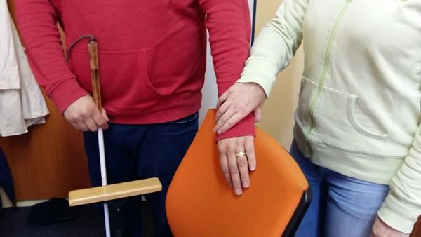
- If you need to help your client getting into the car, all you have to do is place your hand on the door handle. When getting into the car, the blind person should check the door with one hand and the upper edge of the car door with the other, so that they have as much control as possible over the space that they are entering into. Feel free to show them the top edge of the open door if they do not do it themselves. If the blind person finds the handle and the upper edge of the door, they will be able to get into the car by themselves.
- Any information about the area and obstacles in front of a blind or a legally blind person increases their safety when moving and is always welcome.
- If a blind or a legally blind person moves regularly in an environment, it is advisable that they get acquainted with it. They will then be able to move independently in it and avoid any "dangerous" places that might cause injury without depending on the help of another person. When describing such spaces, it is necessary to inform the blind person not only of where something is located, but also to point out where they could be injured (e. g. poorly fixed opening doors on electrical cabinets, lowered ceiling or shelves at head height, information boards on route, etc.). You can also inform them of any objects that they might inadvertently cause to fall over.
- The following obstacles may be dangerous for blind people:
- Objects at head height (e. g. shelves, open cabinets);
- Objects up to waist level and on the ground (unsecured objects, creased carpets, coffee tables, but also bags that they may trip over);
- Obstacles along the guiding line, e. g. next to the wall (flower pots, advertisement banners, doors ajar).
5.4 Rules for adjusting group work with a visually impaired participant
Here are some suggestions that might come in handy when you need to involve a visually impaired participant into group activities if you use them in your work with clients. There are a few things to keep in mind when planning and implementing activities.
5.4.1 The room
The first thing is to adjust the space where the group activity shall be taking place. If the activity is planned for a whole day, a visually impaired person needs to be familiarised with the room in order to be able to move in it independently. Do not forget that if the furniture is moved during more extended group activities, it is necessary to inform about it out loud so that the blind participant can "update" their mental map of the room. If it is a one-time activity, it is advisable to ask one of the participants to guide a visually impaired person when getting acquainted with the room. It is necessary to ensure discipline with closing doors and windows so that they do not become an obstacle for the blind participant (this is especially true of obstacles at eye level that white cane cannot pick up).
5.4.2 Preparation of the group activity
During discussions, participants should be instructed to always introduce themselves by name at the beginning of their speech. In this way, a visually impaired person can connect voices to people, so that if they want to enter into a discussion with any given participant, they already know who to look for and address. Unlike other people in the group, a visually impaired person relies solely on their sense of hearing to recognise people.
5.4.3 Documents and presentations
When preparing a group activity, it is generally preferable if the participants have the opportunity to study documents in advance. This is especially important for blind and partially sighted people. Digital communication – via the office's website or its social media or contact via email – has become the simplest and most accessible form of communication for many visually impaired people.
However, for some – especially the elderly – who are not digitally literate, being read to (in person or by phone) remains the primary source of information. If you want documents that you are distributing during the group activity to be "readable" even for the blind or legally blind participants, it is necessary to verbally convey their content to everyone during your presentation.
If you present plans, tables with budgets, graphs or photographs, you need to describe them in a sufficient amount of detail. What is an adequate amount of detail? First of all, do not change your vocabulary and do not avoid words that you commonly use (such as "here you can see", "please notice" or "take a closer look"). The basic rule is that everything must be stated out loud and be briefly described. In presentations, we often summarise topics into bullet points to make information visually clear. However, for a person with impaired vision, such visual presentation might be incomprehensible (e. g. due to a too detailed explanation by the lecturer). Ideally, the bullet points in your presentation, need to be read out and emphasised orally. However, it is necessary to maintain an appropriate degree of descriptiveness so that you do not overly focus on explaining visual information. It is certainly not appropriate to point out that this information is intended for visually impaired participants.
More detailed information on how websites and documents need to be adjusted to make them functional (e. g. electronic questionnaires and forms) and fully accessible (readable) to visually impaired people is given in Chapter 4 on the accessibility of information. Every organisation that deals with people with visual impairment has developed e-accessibility rules.4-7) When creating documents for the public, where we assume the participation of visually impaired people, it is appropriate to follow the principles of Clear Print8) (typeface, contrast, scale), as these principles facilitate vision even for the elderly.
5.5 Conclusion
We believe that the information from previous chapters on the accessibility of the physical environment (Chapter 3) and the accessibility of information and documents (Chapter 4) in combination with information provided in this chapter shall help you to establish effective rules of communication with visually impaired people and help you to involve them in the group activities that are offered to all clients of your office.
If you have any other questions that we have not managed to answer in this chapter, do not hesitate to contact the organisations that work with visually impaired people.
5.6 Bibliography
- Sme medzi vami. Kol. autorov. Bratislava: Slovak Blind and Partially Sighted Union, 2016.
- Měchura, Milan: Efektívna komunikácia a sprevádzanie osôb so zrakovým postihnutím - Príručka pre pracovníkov s mládežou.
- Corn, A. and Alan J.Koening: Foundation of Low Vision. New York, AFB Press, 1996
- Prístupnosť informácií, web ÚNSS
- Metodická príručka pre tvorbu elektronických dokumentov. Kol. autorov. Bratislava: Slovak Blind and Partially Sighted Union, 2007.
- Lecký, P.: Tvorba prístupných elektronických dokumentov. Bratislava: Centrum podpory študentov so špecifickými potrebami – Univerzita Komenského v Bratislave.
- Web Content Accessibility Guidelines (WCAG)
- Jasná tlač